When Sam Fender was announced as the 2025 Mercury Prize winner for People Watching, it felt like something bigger than just another music award. As someone who frequently gets involved in the North East music scene, hearing him call our area the ‘best region in the country’ and show pride in his roots felt more inspiring than most musical milestones in recent years. For the North East, the award could be seen as a symbolic turning point: a recognition of not only Fender’s talent, but also the cultural energy of the North East finally getting its time to shine.
People Watching was praised by the Mercury judges as standing out for ‘its cohesion, character and ambition’, which couldn’t ring truer. Songs like ‘Chin Up’ and ‘TV Dinner’ are deeply powerful due to both their melodic qualities and their raw honesty. Personally, however, the highlight of People Watching was the use of the Easington Colliery Band for the accompaniment on ‘Remember My Name’. The use of this brass band harkens back to the North East’s industrial roots and gives voice to his family’s working-class heritage; it is therefore all the more important that he chose to use a County Durham band, granting visibility to North East musicians and musical tradition.
For the first year, the Mercury Prize celebrations were held outside of London, instead being held at Newcastle’s Utilita Arena. This is incredibly significant in recognising that the North East is often overshadowed. The region has long produced talent such as James Arthur, Sting, and Maximo Park, but is rarely framed as a cohesive ‘scene’ in the same way as places like Manchester. The region’s industrial decline and economic inequality have often shaped its identity, with musical output often framed as isolated success stories rather than evidence of a living, breathing (yet underfunded and overlooked) ecosystem.
There is a possibility that this could become a catalyst for wider improvement. Firstly, visibility in itself matters. When a globally recognised artist succeeds without abandoning his background, it validates the ambitions of those in his wake, changing the idea of ‘making it’ from a dream into a feasible possibility. Moreover, this visibility could attract public arts funding and more touring investments, giving venues like Newcastle’s Cluny, Sunderland’s Independent and Stockton’s Georgian Theatre the help they need to nurture the next wave of talent. The Mercury Prize itself has directly facilitated this through their 2025 Mercury Fringe, creating workshops and performance opportunities for upcoming local artists. A highlight of this initiative was seeing Middlesbrough’s Finn Forster, fresh off supporting Stereophonics on tour and playing the main stage at Kendal Calling, both perform and discuss the importance of support for North East creatives on BBC Look North.
However, we must remain realistic in our optimism. A single win for the North East cannot overturn decades of centralisation within the music industry. Many labels, media outlets, and funding opportunities still lie in the South; without investment in North East musical infrastructure, there is a risk that this victory will remain as a symbol rather than cause tangible change. We must, then, turn our heads towards the projects creating positive opportunities that are already present within the North East. For instance, regional festivals The Gathering Sounds and Stockton Calling occur yearly, bringing big names in the indie scene to headline local venues, such as Keo and Circa Waves, therefore bringing paying music lovers into local music venues. In doing so, they also generate gigs for upcoming musicians, such as Newcastle’s Labyrinthine Oceans, Teesside’s Marina Josephina and Durham’s own Jam Tub. There are also groups such as Generator, an organisation committed to uplifting the North by providing opportunities to grow and progress for those pursuing music.
In an interview following his win, Sam Fender was asked what this achievement means for other North East musicians, to which he told the interviewer to ‘ask them’, placing the conversation back into the hands of grassroots artists. This year’s Mercury Prize encouraged critics and audiences to look beyond the centralised creative hubs and reframe the map of British music. Whether this moment becomes a watershed or a footnote depends on what happens next and whether the industry decides to finally act. But, for now, support North East venues, stream local bands – and who knows? Not only might you get bragging rights when your new favourite artist blows up, but you can help facilitate the dreams and livelihoods of talented creatives who may have been overlooked otherwise.
I’d love to speak with Leonard. He’s a sportsman and a shepherd. He’s a lazy bastard, living in a suit. – Leonard Cohen, ‘Going Home’
In 1994, the Canadian poet and musician Leonard Cohen escaped to the mountains outside Los Angeles to study Zen Buddhism with the monks at Mount Baldy Zen Center. He lived there five years, becoming himself an ordained Buddhist monk, drinking whisky and writing poetry, before returning to civilisation. “I wasn’t looking for a religion,” claimed Cohen, “I already had a perfectly good one of those.” The abscondment to the mountains was, to Cohen, the only logical way to escape the hard-drinking, depressive malaise into which he’d fallen during the early 90s. Failing to find answers in psychoanalysis, Cohen “bumped into someone who seemed to be at ease with himself and at ease with others” and headed for the hills. Many of the poems Cohen wrote during his time at Mount Baldy would appear in Book of Longing, his first book of poems since the 80s. The five years at Mount Baldy did not grant Cohen inner peace but nevertheless exerted a manifold influence on his post-millennium work. In 2023, eight years after Cohen’s death, his song Anthem was invoked on boygenius’ track Leonard Cohen, in which Lucy Dacus quotes his observation that “there is a crack in everything, that’s how the light gets in.” before adding her own, that “I am not an old man having an existential crisis at a Buddhist monastery writing horny poetry, but I agree.”
In the years since his death, Leonard Cohen has only continued his elevation to the saintlike status that had begun being afforded him in life. The prototypical poet-singer, the image of his steeled jowls half-covered by the brim of his fedora, grimly crooning his way through one of a lifetime’s worth of sung reflections stands firm in the popular consciousness. He is, alongside friend and contemporary Bob Dylan, one of the true folk heroes of modern culture. He is synonymous with a style of confessional, dreary talk-singing; the standard bearer of a genre which would be picked up by everyone from Nick Cave to Fiona Apple to Cameron Winter. This mystique, however, has always been steeped in his reputation as one of music’s pre-eminent womanisers. Joni Mitchell, his one-time lover, recalled him as a ‘‘boudoir poet’’; his numerous attachments to various artists, musicians, and actresses remain the stuff of musical legend. It was an infamy Cohen himself disavowed: ‘‘my reputation as a ladies’ man was a joke that caused me to laugh bitterly through the ten thousand nights I spent alone’’, he would later reflect. And yet, it is Cohen’s steadfast commitment to cataloguing life’s sordid physicality which sets him apart from the bulk of his peers and embeds his influence into the firmament of popular music.
When Taylor Swift released her twelfth album, The Life of a Showgirl, much criticism was levied against the song Wood and its metaphorical allusions to the penis of Kansas City Chiefs’ tight end Travis Kelce. The song, which compares said appendage to everything from a ‘redwood tree’ to a ‘hard rock’, was described by Guardian critic Alex Petridis as one which ‘‘clambers on a table in a Wetherspoons pub with a skew-whiff bridal veil on its head and an L-plate around its neck and favours everyone in earshot with a loud paean to the size of her fiancé’s penis.’’ As Swift learnt, to write well about the realities of sexual life is no mean feat. In this arena, Leonard Cohen is an unparalleled talent. A poet before a musician, Cohen revels in marrying off the sacred and the profane with wry aplomb. On Chelsea Hotel #2, a beautiful ode to fleeting love that recounts the author’s short-lived affair with Janis Joplin, Cohen offers music’s prettiest account of oral sex: ‘I remember you well in the Chelsea Hotel / you were talking so brave and so sweet / giving me head on the unmade bed / while the limousines wait in the street.’ Cohen finds no shame in confessing his sexual exploits. Heroic couplets and the lilting internal rhyme of ‘bed’ and ‘head’ sublimate the awkward physicality of fellatio into a scene of both aesthetic and emotional gentility. It is as proper to describe one’s lover as ‘so brave and so sweet’ as it is to describe them ‘giving me head’: for Cohen they are two clauses in the same sentence. Cohen does not parse out the beauty from romance, deeming the physical unworthy of poetic attention, but instead accepts the whole.
The body is the central vessel of human expression, in Cohen’s world. Poetry is not the dominion of ideals, but should derive from the hands, mouths, legs and shoulders of the poet. ‘I locked you in this body / I meant it as a kind of trial / you can use it for a weapon / or to make some woman smile’ , a father – whether the connection is one of patrilineage or divine creation is unclear – tells his son on Lover, Lover, Lover. This liturgical notion of life as a ‘trial’ on how to use one’s body is essential and the album at large, New Skin for the Old Ceremony, finds Cohen at the crossroads of this crisis. Written and recorded at the onset of the Yom Kippur War, Cohen is wracked by the spectre of violence. The first verse of Lover, Lover, Lover sees Cohen implore the Father, ‘change my name / the one I’m using now it’s covered up with fear and filth and cowardice and shame.’ – his nomic allegiance to Kohenism becoming itself a summons to arms. Performing on the battlefield in Sinai, Cohen told audience members “I don’t care if their war is just or not. I know only that war is cruel, that it leaves bones, blood and ugly stains on the holy soil.” The question, then, of using one’s body as ‘a weapon’ is not mere poetic speculation. Physical love is the Other to physical violence and, by extension, the imperative. In no uncertain terms, Leonard Cohen is a lover, not a fighter.
Deleuze wrote that “to desire is to become delirious in some way.” Few artists have been as delirious as Leonard Cohen. For him, desire is debasement, the utter annihilation of the self. Voyeurism and the painful art of yearning are as much a part of Cohen’s system of desire as sex itself. With I’m Your Man, Cohen brings to the fore the inherently animal nature of passion – ‘I’ll crawl to you baby and I’d fall at your feet / and I’d howl at your beauty like a dog in heat.’ On Paper-Thin Hotel, a jilted lover listens through the wall as the subject of his affection makes love to another – ‘the struggle mouth to mouth and limb to limb / the grunt of unity as he came in.’ This non-adultery is, to the speaker’s surprise, a relief: ‘A heavy burden lifted from my soul / I heard that love was out of my control.’ Without the bodily specificity, such a song fails in its object. It is the realities of physical love, the grunting, struggling messiness, which knock the speaker out of his poetic revery. Life moves on whilst we wax lyrical. Indeed, Cohen’s most enduringly popular love song centres on a woman with whom he never actually had a relationship. Suzanne Verdal, with whom Cohen walked Old Montreal and drank Constant Common tea, was a woman Cohen only “imagined” having sex with. The lack of physical intimacy is no hindrance, it would seem, as the bodily connection extends to a mental-spiritual one: ‘you’ve touched her perfect body with your mind.’
boygenius’ ironic half-dismissal of Cohen the horny poet speaks to the gross missteps of our modern musical luminaries. It seeks, with superior morality, to extract the poetry (‘there is a crack in everything / that’s how the light gets in’) whilst distancing itself from the old man who wrote it. The truth is, of course, that we can’t have one without the other. The same Cohen who wrote Bird on a Wire also wrote Don’t Go Home With Your Hard-On. More urgently than that, though, is the latent desire on the part of many artists to painfully over-correct from the hyper-sexualised misogyny of the pre-MeToo cultural sphere by sanitising life to the point of sterility. For many contemporary artists, the reality of bodily existence is a messy inconvenience, best kept at an arm’s length. Artists like boygenius’ component parts are at their best when they front the truth of human connection in all its seediness – ‘you are sick and you’re married and you might be dying / but you’re holding me like water in your hands’ – but too often resist the grotesqueness that it is to live and love in a human body. Self-described Cohen acolyte Cameron Winter seems to understand this, mentioning feet in no less than six of the songs he’s released in the last eighteen months. Humanity is inescapably bodily, in its beauty, frailty and vulgarity. Any artist with a claim to understanding life must see the beauty in this as Leonard Cohen so effortlessly did. Bring on the perverts.
It’s like our visit to the moon or to that other star I guess you go for nothing, if you really wanna go that far – Leonard Cohen, ‘Death of a Ladies Man’
“Oddballs dancing, leering at camera, guy shaving a nontraditional part of his body and man ripping his own throat out, woman stabbing herself to death.”
The synopsis above pertains to Richard Kern’s Submit to Me Now (1987). Recognised as a thematic symbiote to its older sister short, Submit to Me (1985), and fashioned with the genre description as a ‘no-wave erotic horror’ that explores the aesthetics of kink, sadism, mutilation, and suicide. The sequel differs from its predecessor with the introduction of one Lung Leg, nee. Elizabeth Carr.
Portrait of Lung Leg, taken by Richard Kern
Lung Leg emerged in the 1980s as one of the defining symbols of New York’s ‘Cinema of Transgression’. When asked to define the word transgression and its applied use within the ‘Cinema of…’, director Kern uses a royal ‘we’ to describe himself and a loose collection of like-minded creatives who sought to make films that put people outside of their comfort zones, emphasising their intention to make the audience feel as though they were seeing something they weren’t supposed to.
“Basically, taking a person’s established ethics and morals and trying to get them a little bit beyond it… to transgress their boundaries”. What this manifesto created was an action painting of experimental film, angry punks, and cow’s blood in place of the human stuff.
Lung Leg first met Kern while he was on set for Sonic Youth’s music video, Death Valley 69.“Lung Leg was just… well, I had never met anyone like that before. I think I was 30 by then and I had met a lot of people, but I had never met someone as weird as her.”
Lung Leg on the cover of Sonic Youth’s 1986 album, EVOL
Together, both director and actor participated in a culture that embalmed the no-wave era, working on projects such as You Killed Me First (1985), Worm Movie (1985), and Fingered (1986) -making any other attempt at transgression look emaciated in comparison.
The concept of a plot doesn’t really exist within these movies, from my viewing experience anyway; what audiences watch instead is a tableau of sadism and masochism and self-mutilation. Having watched a handful of low-quality clips of his work online, I can attest to Kern’s claim that his work transgresses the average viewer’s comfort zone. I also wouldn’t go out of my way to personally recommend his work to the casual viewer. On the surface, his films consist of young women rolling on the ground, making faces at the screen, and handling an array of bugs and reptiles – sometimes men are there too, wrangling themselves into bloody messes. There’s no dialogue in most of them, only the riffing of multiple instruments, making his work easily mistaken for a low-budget music video.
“You work a lot with violence and drug abuse”, asks one interviewer. Kern simply laughs.
When watching Kern’s films, it would be easy to make this association too. The 1980s, New York City, and the underground scene all evoke explicit drug use. In terms of violence, one just needs to refer back to the synopsis for Submit to Me Now. However, beneath the grime, gore, and grain, Kern’s depiction of “women in their 20s” unravels as his self-proclaimed subject matter. It has been the primary focus of his work since Kern himself was a 20-year-old filmmaker in the 80s, and it remains so during his current career as a photographer. Now, it’s through Lung Leg’s jagged persona that I turn towards Kern’s early depictions of women. In You Killed Me First, Lung Leg plays a demented daughter who finally snaps and guns down her family at the dinner table. In Fingered, poor Lung Leg again gets subjected to a spree of sex and violence enacted by Lydia Lunch and her partner. The tagline for Fingered even warns that some may find it “unnecessarily VIOLENT, SEXIST, and DISGUSTING”.
In these reactions, I recognise what literary theorist Julia Kristeva coins as ‘the abject’, that which society casts off in order to hold itself together. “It is not lack of cleanliness or health that causes abjection but what disturbs identity, system, order… the in-between, the ambiguous, the composite”. The women in Kern’s filmography embody what we’re not supposed to see: female anger, female cruelty, female mess. They vomit, they bleed, they brandish weapons. The daughter is flesh of her mother’s flesh and a murderous stranger; the pin-up model is a punk. I think of Lung Leg’s character shrieking at her WASP parents in You Killed Me First: “I’m flesh of your flesh… and you’re just as disgusting as I am!”
To mistake this subject matter of 20-something-year-old-women as perverted and typical for a now 70-year-old man is plausible for anyone all too familiar with the creative industry’s voyeuristic eye. “Just not when it comes to Kern”, I argue to myself.
Medicated (2010-2013) – my favourite modern-day project of his – is a photo series of models staring straight into the camera, holding up the prescriptions that they take and, as the visual narrative develops, depend upon to survive in an ever-confusing adolescence. Most of these women are half-naked, but that’s not the vulnerability Kern wants you to look at. Your eyes scan over the pill bottles in each hand. What’s the prescription? Is it one I know, or will I have to look it up? The bathroom settings are undeniably human and lived-in, each product a glimpse into these girls’ routines and habits. The variation of bodies, faces, antidepressants, antipsychotics, anticonvulsants, amphetamines, attention-deficit drugs, sleeping pills, and birth control (etc.) is enough to make any like-minded and medicated 20-year-old-girl see herself as being a part of this compilation.
“Klonopin/Relpax”, 2014, Richard Kern
“My mom put me on them—no second grade kid is gonna say “I want to go on drugs”. The reason they put me on it was they would tell me to put stuff in my cubby and go sit down and I would just wander around cause I was always thinking about other stuff. That’s what kids do. I’ve only taken this maybe two times in the last year so I can’t say I really think about quitting. I’ve seen too many friends ruins their lives to want to use it much.” – Quotation from Medicated Series, by Richard Kern
Portrait from Medicated – Richard Kern, 2014
Each image is accompanied by a continual written transcript. The dialogue loses its rhythm beside the page’s respective model and her respective prescription. Soon, nothing aligns, and their voices become one.
Kern uses the phrase “since the internet” in one of his interviews as if the establishment of the World Wide Web were some cataclysmic event. This is true, in a way. For someone like Kern, the sudden interconnectedness between everyone and everything made it nearly impossible for transgressive cinema to exist as an underground medium. “I don’t know what underground means… in today’s world”, he states.
During the 80s, Kern’s work was genuinely underground: passed around on VHS tapes, shown at seedy clubs or tiny galleries, utterly removed from the mainstream… a great assault on good taste. Now, those once-scandalous films are readily available: remastered on Blu-ray, streaming online, even screened at MoMA. The taboos that made the ‘Cinema of Transgression’ so bracing have seeped into mass culture. Murder, gore, sex, blasphemy. “Basically all of the shock tactics they employed are all part of the mainstream now,” one blogger notes. He’s right. What was subversive art in 1985 becomes an internet aesthetic this century. The underground didn’t so much disappear as get folded into an algorithm. When every teenager can find extreme horror clips, BDSM imagery, or the latest outré performance art with a quick search, what does transgression even mean? Is transgressive art even possible in a world where nothing is underground for long?
Kern’s own evolution offers one answer: context is everything. He once said, citing John Waters, that it’s fine to be an “angry young man,” but if you carry that rage into old age you just look ridiculous. Times change, and I guess shock must change alongside it. In an era where explicit content is ubiquitous, perhaps the new transgression is to expose what we habitually conceal. With Medicated, Kern turns his lens to the kind of private despair that normally plays out at home or in a psychiatrist’s office. He shows it clinically, yet not without empathy. We, the viewer, are confronted with the epidemic of medicated youth, the normalisation of psychological distress. No cow’s blood is needed here.
Still, I can’t help but feel a twinge of loss for the old underground’s gritty camaraderie. Kern’s was a tight-knit group of punks, artists, and weirdos who needed some form of a transgressive outlet (and were willing to go to physical, often grimy spaces to find it). Today, those spaces have been supplanted by digital ones. To be transgressive now often means pushing into interdicted zones of identity, politics, or morality, which is a different game altogether. Present-day artists have to find new pressure points to press. Some turn the provocation inward, some turn it outward to social critique, and some simply escalate the shock.
So, what remains when the dust settles? For me, it’s the women – Kern’s women. There’s Lung Leg. There’s Lydia Lunch. There are all those dead-eyed girls and their prescription bottles. The raging daughter, the self-destructive punk, the dissociated depressive. Aren’t these all facets of the collective female psyche that society has struggled to acknowledge?
Perhaps that’s why, decades on, these figures still hold a semblance of power… dragging the abject into view, and doing so with women at the centre-frame, in a way that forces a reckoning with how we view that form.
Cover Photo – Richard Kern
Works referenced:
“Abjection.” Wikipedia: The Free Encyclopedia, 23 Oct. 2025, en.wikipedia.org/wiki/Abjection.
Interview with American Underground Filmmaker Richard Kern. YouTube, uploaded by Film&Clips, 22 Aug. 2018,https://youtu.be/yqakhvFdrDo.
Morris, Gary. “Snapshots from Hell: Richard Kern – The Hardcore Collection on DVD.” Bright Lights Film Journal, 1 Oct. 2001, brightlightsfilm.com/snapshots-hell-richard-kern-hardcore-collection-dvd/.
Reinoos, Dana. “Films by Richard Kern.” Screen Slate, 11 Dec. 2017,www.screenslate.com/articles/films-richard-kern.
Supervert. “As Needed for Anxiety: Richard Kern’s Photographs of Pharmaceutical Chic.” Please Kill Me, 12 Jan. 2021, pleasekillme.com/richard-kern-photographs-medicated/.
Storm, Christian. “Richard Kern’s Films Are Still Shocking as Hell.” VICE, 7 Dec. 2012,www.vice.com/en/article/richard-kerns-films-are-still-shocking-as-hell.
The Bloody Pit of Horror. “You Killed Me First (1985).” The Bloody Pit of Horror, 23 Oct. 2020, thebloodypitofhorror.blogspot.com/2020/10/you-killed-me-first-1985.html.
Videowave. 1985 Interview with Richard Kern. YouTube, uploaded by Videowave, 6 Jan. 2018, https://youtu.be/8HXpmk-7NaM.
‘In order to communicate the message entrusted to her by Christ, the Church needs art. Art must make perceptible, and as far as possible attractive, the world of the spirit, of the invisible, of God. It must therefore translate into meaningful terms that which is in itself ineffable.’
– ‘Letter of His Holiness Pope John Paul II to Artists’, 1999
The visual culture of Catholicism does not naturally derive from an appetite for ornament. The earliest occupants of its interior life were men who fled from it. In the deserts of fourth-century Egypt and Syria, the first Christian monks stripped worship of every available excess, reducing religious life to silence, fasting, prayer and the barest material conditions requisite for survival. That this tradition of radical asceticism lies at the root of Catholic theology already complicates any easy association between worship and sensory indulgence. Indeed, Catholic form does not intrinsically lend itself to illustration nor to expression nor even to the beautiful – but crucially it does not refuse these as byproducts of the sensible mediation of grace. To beg the question Why does Catholicism look like that? is to interrogate the means by which the Catholic church makes belief legible – why it translates scripture into bodies and things and space and craft, and why it continues to argue that beauty, when shepherded by the proper hands, is not betrayal of truth, but one of its modes.
At the root of Catholic visual representation lies the doctrine of the Incarnation: the assertion that the Word became flesh, and so the divine enters and inhabits matter without diminishing Creator or elevating creation. Catholicism habitually locates revelation in the transubstantiation of things: bread, wine, oil, water, fabric, light, gold. It is obsessed with the material, the corporeal and the kinaesthetic. The science of Catholic sacramentality firmly insists that the sign is not necessarily signifying in the semiotic, Saussurean sense of things, but efficacious, meaning it both points to and communicates what it signifies. The icon is allowed and venerated not for its own sake, but because it points beyond to the subject which it stands for. It is the sacramental telescope by which we see that which is invisible. Cardinal Nicholas of Cusa made this clear: ‘Creative art, which it is the soul’s good fortune to entertain, is not to be identified with that essential art which is God himself, but is only a communication of it and a share in it.’ (Dialogus de Ludo Globi) Communication, then, lends itself to teaching, does it not? The imagery of the church, as is possibly rather plain, once primarily served a practical purpose as the visual vehicle of catechism. For much of Western history, the fluctuating Catholic population remained largely illiterate. Pictorial gospel allowed for the narration of salvation to the faithful who could not consume the inaccessible Latin of vernacular texts. For this reason, such figures as Saint Thomas Aquinas and Pope Saint Gregory the Great endorsed the theological basis for an aesthetic that privileged intelligibility.
Madonna and Child, Duccio di Buoninsegna, ca. 1290–1300 / Madonna and Child, Il Sassoferrato, c. 1650.
If the visual culture of the Catholic church is solely fashioned for ‘the instruction of the uneducated’ (Aquinas, Commentary on the Sentences), why then do we begin with the dull, painfully emblematic representation of the Madonna and Child in the sacred catechistic art of the Middle Ages, and how do we burgeon into the diffused and delicate, near-ethereal proto-Baroque style of the Counter-Reformation? What necessitates and rationalises this shift? Theologian Hans Urs von Balthasar understands beauty as entirely inextricable from the glory of God, claiming that ‘beauty demands for itself at least as much courage and decision as do truth and goodness, and she will not allow herself to be separated and banned from her two sisters’. (The Glory of the Lord) Beauty is thus the manner in which earthly creatures manifest that glory, and thereby invite love and prayer. This synthesis of ideas finds parallel claim in the more classical, Greco-Roman metaphysic of beauty put forth by Plato: ‘The power of the Good has taken refuge in the nature of the Beautiful.’ (Philebus) It is also an idea agreed upon by ecclesiastical authorities of our contemporary day – the late Pope John Paul II concurred: ‘beauty is the visible form of the good, just as the good is the metaphysical condition of beauty’. The virtuous and the picturesque are essentially tied-up; that which is more lovely to look at is more noble by nature.
Early Christianity inherited from Judaism a deep suspicion of sacred imagery, shaped by Old Testament prohibitions against graven forms (‘Thou shalt not make unto thee any graven image, or any likeness of any thing that is in heaven above, or that is in the earth beneath, or that is in the water under the earth’, Exodus 20:4) and made sharper by the ever-present danger of idolatry (‘Confounded be all they that serve graven images, that boast themselves of idols: worship him, all ye gods’, Psalm 97:7). Under the Roman Empire – where Christians were a persecuted minority and pagan visual culture was both ubiquitous and polytheistic – Christian imagery emerged furtively, under a cloak of ambiguity. The earliest surviving artefacts of Catholic art are to be found in the subterranean caverns of the Roman Catacombs. The grapevine, the peacock, the Good Shepherd – each illustrated motif throughout the tombs deftly held a secondary latent meaning, operating as polyvalent signs intelligible to the initiated, yet inconspicuous within a familiar pagan visual economy.
‘Good Shepherd’ fresco and ‘fish and loaves’ fresco from the Catacombs of San Callisto in Rome.
It was only by way of prolonged doctrinal discourse – finally culminating in the Second Council of Nicaea in 787 – that the Church formally resolved the iconoclastic crisis, and confirmed that honorary veneration of images was permitted, though true adoration was to be reserved only for God Himself. With this conciliar decision, the image was finally affirmed as a legitimate participant in Christian devotion: not an idol or a mimetic attempt at rendering the divine, but a relational object and instrument of worship. This hesitant and cautious quality of early Christian iconography reflects an aesthetic history rooted in vigilance and restraint – certainly not in excess – whether due to fear of persecution or of deceiving one’s own faith. The legitimacy of the Catholic ‘look’ has always been something earned with time.
As Christianity travelled from the margins of Roman society to its imperial centre, its aesthetic posture necessarily shifted. The legalisation of Christianity under Constantine in the early fourth century precipitated a dramatic change in scale: worship moved from the domestic home and secreted altars into public space. And with this transition arrived architecture.
Basilica di San Clemente al Laterano in Rome. Once a private home and site of covert Christian worship in the first century, now a public basilica since the sixth century.
The earliest monumental Christian churches did not invent a new architectural idiom so much as appropriate one already embedded within Roman civic life. Ancient temples or civil buildings, such as the Pantheon in Italy or the Baptistère Saint-Jean in France, were common targets of conversion. Though it was the Roman basilica – used for legal proceedings, commercial exchange and public assembly – which offered a site uniquely suited to Christian worship. Unlike pagan temples, which functioned antithetically as enclosed dwellings for deities and were often visually inaccessible to the populace, the basilica was designed to hold bodies in common, encouraging ritual and interaction. This distinction is paramount: Christianity did not require a house for God, it sought a space for divine encounter. The basilican plan with its longitudinal axis, central nave, flanking aisles and projecting apse embodied the Church’s self-consciousness as a gathered community of people rather than a cult of contained divinity. Particular attention is paid toward space and orientation because this inscribes certain eschatological expectation into the building itself. As clerical hierarchies developed, so too did the structure of the church; the bema, transept and eventually the Latin Cross plan emerged among sacral architects to accommodate liturgical complexity whilst embedding salvation history into the body of the church.
Yet even as scope increased, imagistic restraint largely remained in situ. Early basilicas such as the Archbasilica of Saint John Lateran exhibit an almost paradoxical sobriety. Exteriors relatively plain, often brick, resisting the monumental façades of surrounding imperial architecture. Interiors luminous though hieratic: figures hovering static rather than occupying space as you or I might. Saints rendered frontal, flattened, deliberately dimensionless and disembodied by virtue of theological caution. The sacral image was not yet trusted with naturalism.
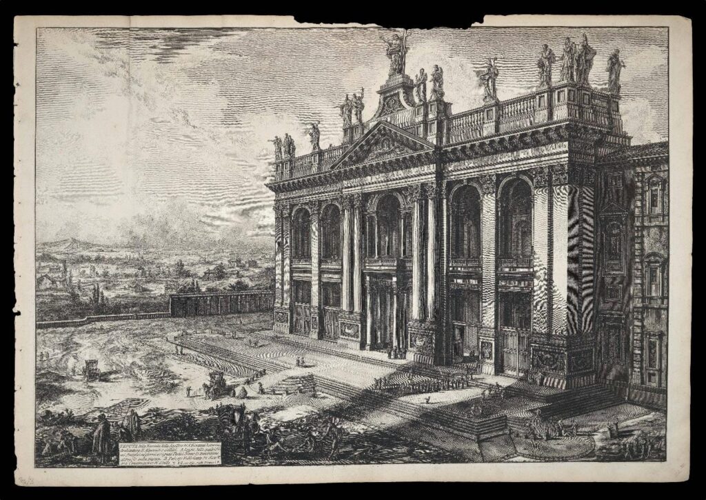
Archbasilica of Saint John Lateran, engraving by Giovanni Battista Piranesi (1775). Founded in 324, it is the oldest basilica in the Western world.
With the emergence of Gothic architecture in twelfth-century France came a decisive aesthetic turn towards aspiration and height – both literally and religiously. The introduction of such iconic features as the pointed arch, rib vault and flying buttress reconfigured the model understanding of how the Catholic church presents itself. By redistributing structural weight outward and downward, Gothic architects freed interior walls, allowing for new height and light. Churches rose vertically, straining upward as though neck vertebrae, their skeletal frames reaching into dizzying spires and dissolving into expanses of stained glass. Worshippers were bathed in truth and righteousness, God’s presence streaming in from the apertures, cradling faces with long, kind, coruscating fingers.
Characterised by immense human labour, intricate geometrical design and centuries-long construction projects, the building of a Gothic duomo or cathédrale must be understood first and foremost as an act of worshipful tribute, not an indulgence in creation itself. The church was a collective offering on behalf of the people, a sustained and painstaking liturgy enacted across generations of effort and attempt. Effigies grew increasingly vivid, rose windows with intricate mullions and tracery impressed the eye, detailed frescoes spilled marvellously onto lofty cross vault ceilings. The Church was no longer the self-effacing provider of a place of worship; it had now begun to shape the Catholic’s sensory imagination. Still, the visual of the Gothic remains vertical, gestures heavenward; it does not yet engulf. That shift only comes on the heels of crisis.
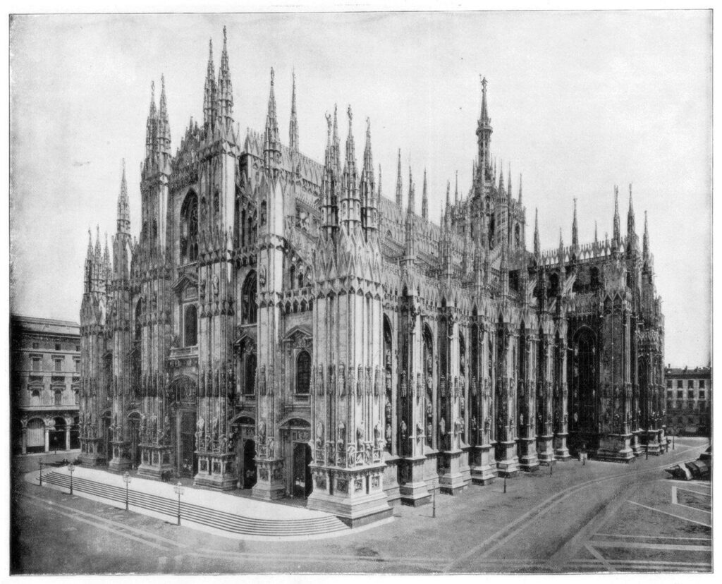
Duomo di Milano, John L. Stoddard, 1893.
The Protestant Reformation of the sixteenth century saw an attack on sacred material culture. Images were condemned as distractions, the splendour of structure as a corruption of pure faith. Iconoclasm was the logical terminus of reformist zeal, the consequence of a faith-branch which understood entitfied religious practice as an obstacle to worship rather than its vehicle. In response, the Catholic Church was forced to articulate – explicitly and defensively – the core principles which had long undergirded its aesthetic culture. The Council of Trent reiterated the legitimacy of sacred images as pedagogical and pastoral necessities: art was reaffirmed as the endeavour of teaching, moving and converting. The Counter-Reformation – soon to be followed by the Baroque – had settled upon the Western religious world.
Intensely concerned with the bodily, the Baroque church is the church of the corporeal. It is a space – elastic and kinetic where it was once static and axial – engineered to produce affective response. Awe, disorientation, intimacy, rapture, overwhelm. Columns twist and hurtle upward. Ceilings open into illusionistic heavens which collapse the now-foggy distinction between the earthly and the divine. Perhaps most critical is the dissolution of inherited boundaries between artistic mediums in order to overburden the spectator’s capacity for detachment. Architecture frames sculpture; sculpture erupts into painting; painting bleeds into the calculated orchestration of light itself. Nothing remains autonomous, nothing stands in solitary. The gesamtkunstwerk of the Baroque church constitutes a single persuasive apparatus, calibrated to render theological abstraction experientially irrefutable. Devotion is no longer confined to the mind or mediated primarily through scripture; it is staged as a transcendent encounter unfolding in real time before and around the worshipper. God feels proximate, inconceivably so.
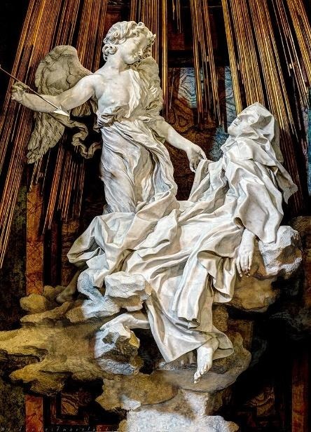
Ecstasy of Saint Teresa, Gian Lorenzo Bernini, 1652.
I ask you to consider Bernini’s Ecstasy of Saint Teresa as a prime instance. The collapse of the body, the slackness of the jaw, the give of the posture inviting divine invasion. Hidden windows flood the chapel with golden light; marble becomes skin before you; architecture frames the allegory of revelation as a spectacular event. Grace acts upon the body. We are less observer and more witness here, are we not? Hand over mouth, breath held, frozen in this theatre of the ecclesiastical.
At the risk of sounding impious, when one steps into a seventeenth-century cathedral at times it does very much feel like stepping into an opera house. The Baroque is infatuated with theatricality, with staging and motion and chiaroscuro and synergy with the senses. Gold leaf and incense and marble and mosaic and choral polyphony and monastic chant and processional banners. It adores texture and lustre and materiality. Urges lavishness as well as durability. And what of scripture – the written Word? ‘Forasmuch then as we are the offspring of God’, the New Testament insists, ‘we ought not to think that the Godhead is like unto gold, or silver, or stone, graven by art and man’s device’. (Acts 17:39) I remind you that objects of sacramental action command honour, serving as intermediaries between heaven and the earth. What are the vestments and vessels of Catholic worship if not the Church’s firm and concrete assertion that the sensible is our only means to communicate the eternal? To signify the worthwhileness of the world God has created? Gold cannot make God more precious.
Apse of St Peter’s Basilica in Vatican City.
One of our greatest popes, John Paul II, wrote a deeply galvanising letter addressed to the artists of our day in 1999. Within this letter, he asks the question ‘Does the Catholic Church need art?’ He responds in the affirmative:
‘Art has a unique capacity to take one or other facet of the message and translate it into colours, shapes and sounds which nourish the intuition of those who look or listen. It does so without emptying the message itself of its transcendent value and its aura of mystery.’ (‘Letter of His Holiness Pope John Paul II to Artists’)
Though perhaps more of interest and quite remarkably, he also begs the question: ‘Does art need the Catholic Church?’ On this dynamic, he says ‘it has been a great boon for an understanding of man, of the authentic image and truth of the person’, and invites artists to ‘enter into the heart of the mystery of the Incarnate God and at the same time into the mystery of man.’ In our contemporary cultural economy, it is compelling and tremendously significant that the Catholic visual language survives in secular culture.
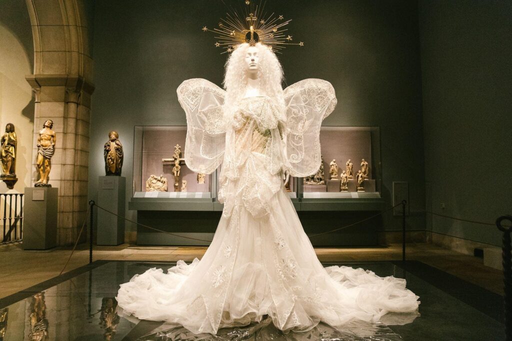
Its aesthetic vocabulary of precious metals, brocade, embroidery, architecturally-informed silhouette and sacred motif continues to resonate, particularly in the world of fashion. In 2018, the Metropolitan Museum of Art Costume Institute hosted an exhibition titled Heavenly Bodies: Fashion and the Catholic Imagination. Curated to explore the intersection of sacral visual codes and haute couture, it featured creations from Dior, Valentino, Jean Paul Gaultier and Dolce & Gabbana among many others, highlighting how liturgical chasubles, conical mitres and bejewelled reliquary crosses may function as purely visual language, divorced from worship though still inviting conversation and commemoration.
Heavenly Bodies: Fashion and the Catholic Imagination at the Metropolitan Museum of Art / John Galliano for Dior: Evening Ensemble, Autumn/Winter 2005–6 Haute Couture.
Catholic imagery seems to thrive in this postmodern cultural afterlife because it carries an almost preternatural formal logic. For non- or nonpracticing Catholics, its characteristic verticality, hierarchy, symmetry and ornamentalism are legible even without contextual doctrinal framing. Gold filigree retains its connotations of sacredness, authority and value whether it is found in the Igreja de Santa Clara or the bodice of a John Galliano gown. Crucifixes and rosaries become motifs in jewellery, home decoration, graphic design. Even sans liturgical function, they signal drama, gravitas or a sense of ritualised performance, making them attractive to visual directors and cultivators of culture. The potency of Catholic iconography persists – whether celebrated or critiqued – independently of explicit belief, and its visual lexicon continues to exert cultural influence even in a world that may no longer consciously acknowledge its origins.
Featured Image: ‘María Santísima de la Aurora’, Francisco Romero Zafra, 2008
I prefer my heroes a bit shit, thanks very much. Dour and perturbed out on the peripheries, frankly I’d prefer it if they didn’t even save the day. Leaning against an oblique wall, my beau ideal cups their crooked fag against the jetsam and bluster of the battle they slope to inattention for.
David Berman leant this way, I think. He seemed, wearily, to be laboring against something; in a costume of faded jeans, an unwashed shirt and a cape of stale cigarette smoke fluttering behind him, he fought strange fights of hearts backfiring and red-rusted souls. With a smoked southern drawl of weary nonchalance and jagged pain, he seemed to be drenched in the idiosyncrasies that one finds watching a beautiful sunrise from a motorway flyover, completely off your face.
His main band, the Silver Jews, sputtered into existence sometime in the late 80s, someplace in upstate New York, and started life recording shambling tunes into peoples answering machines. Working as security guards at the Witney museum, Berman and his bandmate Stephen Malkmus were, I imagine, immersed in the post-modern abstraction and rarified boredoms of a conceited new culture. If I were pretentiously inclined I may say they strove to redress the exploding of structure’s ensuing isolation and other such brave new bullshit. Abandon your post-structural theses and assaults on the continuity of comprehension here, however, as we see before us a layman’s group in the most beautiful possible sense.
Releasing seven studio albums over fourteen years, the Silver Jews charted the course of the weirdos and wanderers of the American landscape. Despite holding an MA in poetry and being a published poet, Berman’s group was not an urbane exercise in the oddities of parochial backwaters and faltering dreams. His was a true and trembling band of somewhere in-between. Lyrics spun out of Kenneth Koch and William Faulkner’s acid infused dreams, and a group of musicians who played like their trousers were falling down, made a group that seemed too weird to live, too rare to die. Their loping shabby songs of lo-fi indolence and ingenuity were too piercing and too perverse to ever take center stage, too poignant and profound to be relegated to the annals of indie landfill.
Cruelly then, it is fitting that the 90s music press maligned them as a side project to Malkmus’s main group Pavement, darlings of the alternative era. Fulfilling your own prophecies I should imagine is seldom an enviable position to find yourself in, and in this sidelining David Berman got rather too close for comfort to the reflection of the half forgotten worlds about which he wrote. That intimacy with the inverse of the American ideal, however, gave birth to what is generally considered Silver Jews’ defining record, American Water. The album epitomized the wit and wonderment, the gothic and the absurd, with sardonic disaffection, a disillusioned prophet incanting his drole wisdom, merely glimpsed through the creaking screen door of a tumble down honky tonk.
I shan’t say though that they triumphed over adversity, for the opulent sweep of a triumph seems an anathema to their elegizing of the down at heel and just plain peculiar. Rather I imagine it bought Mr Berman a step too close to embodying his subject matter. Hailing from West Virginia, our raffish hero did not come into this world as an introverted troubadour or baleful soothsayer of a forgotten world of rickety dreams. Berman was the son of one of the most egregious and hateful lobbyists in Washington, so grew up for all intents and purposes affable and affluent, far from suckling on the American dream he came to find so disreputable. So maybe there’s the tension, the catalyst behind his catalogue of slackers and outcasts. When Berman disbanded the band in 2009 he claimed, defeatedly, that his music couldn’t begin to undo the enormity of the damage his father had done to American society.
I suppose that clung to him and his art throughout his career, peppered with depression and suicidal thoughts. You can hear it in the conclusory song ‘Pretty Eyes’ off 1996’s The Natural Bridge, his voice ringing hollow and profound with the unearthly anguish of an extreme sleep deprivation he was hospitalized for the moment he finished the song. Post-American Water, in a scene that veers between the prophetic and the melodramatic, he crawled into the Tennessee hotel suite Al Gore watched his 2000 election loss from to overdose on painkillers, proclaiming his wish to die where democracy did.
Berman took his own life in 2019, days after releasing his final album, Purple Mountains, pre-empting grief and bereavement with his unique amalgamation of insight and deflection, repartee and honesty – the funniest and most wrenching suicide note one could possibly conceive of. So where does that leave me and my languid sage? If nothing else, the wonderful immersion of his curling lyrics proved invaluable to me when I was looking for someone to rip off when writing crap angsty poetry as a teen. I suppose the appeal lies in that mercurial world of catharsis, for I can imagine him saying that the view from the second place podium is a tonic of bittersweet wist. I don’t want to hackney the sentiment that he makes one feel sufficient in place of inadequacy, so I posit that he speaks to the clouds drifting across the sun, of the erroneous beauties whispered through the battles of each day. He seems to me to be the hero of what could have been, of falling short of the mark, of an unusually vivid humanity.
‘Repair is the dream of a broken thing, like a message broadcast on an overpass, all my favourite singers couldn’t sing’.
David Cloud Berman, never a truer word was spoken. God knows you can’t sing, but I wouldn’t have it any other way.
As a footnote, that is the only lyric quote I have included here because I cannot bring myself to spoil the visceral poignancy you may find in them when you are particularly low.
There’s something about George Harrison’s All Things Must Pass that feels uncannily British — not the old empire kind of British, but the rain-soaked, quietly resilient, half-resigned version. Released in 1970, the triple album came out just as the country began to feel the slow ache of decline: post-Beatles, post-utopia, post-swinging-sixties London. Even its title felt like an elegy for a fading Britain.
Fifty-five years later, the sentiment lands harder than ever. All Things Must Pass nowplays like a requiem for a country trying to convince itself it’s still special — a soundtrack for the long, unglamorous hangover after the party of empire, of cool Britannia.
When Harrison wrote All Things Must Pass, he wasn’t being cynical. He was being spiritual. He’d seen the machinery of fame and ego up close and come out the other side searching for something gentler, truer. The song’s calm acceptance of “sunrise doesn’t last all morning” felt like wisdom at a time when Britain still thought the sixties might never end. But in 2025, it sounds more like a prophecy. It seems like the sun’s been setting for a while now.
Public services are crumbling, rivers are filling with sewage, and politics has become performance art for bitter men with microphones. Reform UK gains traction by promising renewal but selling racial resentment; Labour promises competence, not hope, yet fails to deliver on both. Everyone’s tired, and the rain keeps falling.
Harrison’s voice, patient and forgiving, may hum through the noise like a counterpoint: It’s not always going to be this grey. But yet, it is — for now.
Britain has always excelled at melancholy. We make poetry of drizzle and drama of decline. From The Waste Land to The Crown, we aestheticise decay until it almost looks romantic. Harrison, though, wasn’t interested in performance. His melancholy wasn’t self-pitying; it was cleansing. He offered resignation not as despair, but as liberation, which is a lesson the modern political class could use. Today’s leaders — Farage shouting from a pub, ministers performing contrition on breakfast TV — cling to power like it’s still 2012, still possible to summon optimism with a slogan. “Levelling Up” has become a punchline; “British values”, a meme.
Harrison would have recognised this noise for what it is: pure ego.
Beware of Darkness, one of the album’s most haunting tracks, could be mistaken for a sermon to the electorate. “Beware of greedy leaders / They take you where you should not go.” In 1970, that might have sounded like Eastern mysticism. In 2025, it’s practically the daily news cycle.
The album was partially recorded at Friar Park, Harrison’s eccentric gothic estate, and the iconic album cover was shot there — half-mansion, half-monastery. The walls, lined with gargoyles and silence, gave him the distance to write a work of self-reflection, something Britain rarely manages. Today, the country feels like it’s still living in that house — ornate, damp, haunted by the past. We’ve filled the rooms with nostalgia: wartime mythologies, royal weddings, Great British Bake-Offs. It’s charming, but it’s also claustrophobic. Every institution, from Parliament to the BBC, feels like it’s decaying in slow motion.
Harrison’s mantra — all things must pass — isn’t just an observation; it’s an instruction. Empires fall. Economies falter. Cultures shift. The task isn’t to stop it happening, but to let it happen, and then begin again.
But Britain doesn’t let go. We polish the relics instead.
But for one moment, imagine if we actually took Harrison seriously — if the country released its grip on the fantasy of exceptionalism. Reform UK wouldn’t exist; it depends on the illusion that decline is reversible, that we can simply vote our way back to the 1950s. Nor would the endless nostalgia industry that props up our media — the monarchy, the Blitz spirit, the Beatles themselves — work without the promise that the past can be restored.
Harrison’s message was the opposite: transcendence through impermanence. Growth through surrender. The idea that endings aren’t failure, but natural order, and maybe that’s the radical politics we need now — not rage, not revival, but acceptance. To look honestly at what’s rotting and stop pretending it can be repainted.
Listening to All Things Must Pass in 2025 Britain feels like stepping outside the chaos for a moment. The songs drift like prayer — full of humility, humour, resignation. Harrison’s slide guitar sounds like light breaking through fog. It’s an album that insists, even amid decay, on grace.
And perhaps that’s the hope we’re left with. Not a new golden age, but a quieter one — where kindness outlasts the slogans, where humility replaces bluster, where we stop shouting about greatness and start doing small good things.
Because if Harrison was right — if all things must pass — then this too will. The populism, the cruelty, the endless decline. The question is what we’ll build in the silence that follows.
Until then, the rain keeps falling. The records keep spinning. And somewhere, faintly, George Harrison’s voice reminds us:
It is a more than well-known fact that there is simply nothing new in fashion; all is a rehash upon rehash of older ideas, cuts, and silhouettes- with the exception perhaps of fabric. Nonetheless, it is still interesting to examine the comparisons we can draw with the past and how these may hint at the ways in which fashion may evolve in the future. This article will focus on men’s fashion with all the authority of someone who watches too many films, looks at too many clothes, and picks up some of Hardy Amies’ books from time to time. In my opinion, the 1930s arguably saw the peak of the suit. Focused on both style and practicality, the thirties flowed with softness and ease of wear in its fashion. Broad shoulders and well-fitting garments designed to exude confidence and effortlessness, and most importantly, simplicity. This, I believe, is seeing a revival in the style of the everyday man’s wardrobe, as well as among stars on red carpets across the globe.
The first thing that occurred to me was what YouTuber James Leung refers to as the “2025 uniform”. This, as one is probably aware, tends to involve larger, wide-legged trousers paired with a well-cut t-shirt and some form of polished boot or shoe. Now, how exactly does this reflect the 1930s? Well, the ease of this type of outfit and the emphasis on basic, comfortable clothing are clear indicators. If we were to examine the suits common in early 1930s Germany, we would encounter loose-fitting trousers that flowed neatly down from the waist, usually accompanied by pleats. These loose trousers permitted a clean break above the shoe, a feature often mirrored in contemporary fashion. This, however, was not restricted to Germany- rather reflecting a shift toward practicality within men’s fashion in a post-Wall Street crash world where men would have less time for leisure and would look to own curated items that would last comfortably, whilst also retaining some of the finery of the 1920s.
Furthermore, the influence of The Great Depression saw an increase in workwear being utilised more openly- with the serial production of French chore coats by the likes of Le Laboureur and Vetra, allowing working-class fashion to evolve further in Europe (If you want to know more about Le Laboureur, I would recommend Albert Musquiz’s YouTube channel). In the USA, there was also a boom in workwear fashion, with Levi’s and Carhartt gaining nationwide prominence with the emergence of the first Carhartt jacket, the “Engineer Sack Coat,” in 1925. Workwear in fashion is not restricted to the 2020s; however, there is a clear increase in the sourcing of pre-loved or softened workwear for incorporation into the fashion world, which has led to online trolling of individuals for ironically having “soft hands” while donning traditional workwear, arguably demeaning and accessorising its blue-collar roots. US workwear appears to be in high demand at present, consistent with a broader pattern of US influence, particularly through film stars, celebrities, and social media influencers.
A key focus must also be placed on the cut of suits and trousers. Gone are the days of oversized and baggy apparel; people instead want well-fitted clothing that accentuates their bodily features most prominently from the waist up – perhaps aligning with an increased focus on health and fitness within influencer circles. In the earlier example of the t-shirt and larger trousers, there is a clear distinction between being ‘larger’ and being ‘baggy’. These large trousers still sit tightly at the waist, usually in a high-to-medium waist fit. Notably, these trousers often do not require a belt to cinch any excess material; instead, an increasing number of designers are reverting to systems such as English side straps or Gurkha waistbands. This is well modelled by the likes of actor Jacob Elordi, who often wears double-breasted suits that reinforce 1930s-style motifs. As such, the cut of these trousers appears to model that of the 1930s, with larger yet well-fitted garments that accentuate one’s waist whilst also adding volume to the legs. On a personal note, I believe this is a welcome step away from the tight Tom Ford suits of the 2010s, which I, for one, hope do not come back into fashion.
Finally, a note on t-shirts and jackets. In this case, I will use Mutimer as an example. Currently, Mutimer is really the driving brand in men’s fashion beyond the runway, with sleek silhouettes that lend themselves to everyday use and styling, offering a sense of effortlessness whilst also retaining a put-together look. Hardy Amies famously wrote, “A man should look as if he has bought his clothes with intelligence, put them on with care and then forgotten all about them,” and I believe this to be clear within Mutimer’s brand vision. They recently released a new T-shirt labelled “The Jagger T-shirt”, faithful to the cut and shape of its namesake, Mick Jagger, yet adopting shorter sleeves and a tighter fit- it does away with the boxy tees popularised by skate fashion, instead aligning with the 2025 uniform, accentuating your features with a simple, unabashed silhouette. Much like the fit of Marlon Brando’s t-shirt in Streetcar. This can also be seen in jackets; the Mutimer leather jacket, conveniently always sold out, features a cropped fit typical of most biker jackets, yet also contributes a snug waist reminiscent of military styles of the late 30s and 40s, such as the No.5 battledress or General Jim Gavin’s modified officers’ jacket.
There are many comparisons to draw, but I believe that overall, a 1930s style revival is totally beneficial to men’s fashion as it blends practicality, comfort, and elegance, in turn allowing the wearer to curate a more long- lasting wardrobe not driven by fast fashion but rather by timeless classics which focus more heavily on fit rather than flair.
Consider the train. There is, perhaps, no greater symbol of the industrial age, of mankind’s advancement from agrarian primitivists to mechanised modernists than the hulking mammoth of steam and steel, rattling through sceptred fields and countryside. It permeates the psyche of modern society; the great communitarian dream that we might, united by rail, draw nations and continents together as one. Even as its atomistic rival, the dreaded motorcar, threatens its position, it remains a potent image of our contemporary world, and the hope of what it might be. No wonder, then, that it has seeped so heavily into the language of visual storytelling. The train is, like the telephone booth or the six-shooter, one of those enduringly anomalous staples of the moving image. How else to tear lovers apart or prompt random meetings across a train carriage? For over a century, since cinema’s very conception, the train has been an indispensable tool of symbolic relevance, a tool too often overlooked as merely perfunctory. In considering and unwinding the manifold resonances of the train on film, we might come to a better understanding of just how spiritually relevant this marvel of invention truly is.
Britain’s cultural consciousness, to its great disadvantage, lacks the figure of the cowboy. Where American national storytelling may always fall back on the image of the brooding sheriff traipsing endless flatlands on horseback, Britain is forced to recede deep into its medieval past to find any similarly entrancing historical archetypes. Perhaps, then, we supplant the train as our own kind of cowboy. A post-industrial mammoth, stoic and unfeeling, rounding the hills and valleys with unitary purpose. 1936’s Night Mail, a documentary – perhaps the first in Britain’s cinematic history – charting the progress of the overnight postal train, accompanied by a specially commissioned W.H. Auden poem and Benjamin Britten score, certainly makes this argument. The train hurtles from London to Scotland, an egalitarian troubadour at the nation’s service: ‘letters for the rich, letters for the poor, the shop at the corner, the girl next door’. Workers tirelessly sort through envelopes, placing each on specially chalked town-specific shelves. Mailbags are yanked from hooks by purpose-built nets at passing stations with a mechanical, stolid brutality. Auden’s poem is set to the metre of the train’s passage, a relentless onslaught of brusque couplets, dispassionately toasting the broad cross-section of British life past which the engine runs – ‘letters from uncles, cousins, and aunts, letters to Scotland from the South of France’. That the film, produced by the Post Office so as to increase public perception of the service and to dissuade the challenge of privatisation, should choose to tie the figure of the postal engine into this poetic system is something of a small wonder. This is no mere advertisement, but an argument for the incontrovertible necessity of the railway to British life. Across Night Mail, the railways become veins through which the blood of the nation runs. The train is positioned as a uniquely British kind of hero: deferential, resolute. The documentary serves as a hymn to this unsung champion of modernity. There is a note of George Eliot about the whole thing, an industrial echo of Middlemarch’s closing paragraphs: that things are not so ill with you and me as they might have been is half owing to the number of locomotives which have run a hidden service from Euston to Aberdeen and rest in unvisited depots.
The conclusion of Night Mail, the poem and the film, is a revelation about the fundamental importance of the postal network, its manifold powers of connection, and thus the train’s ultimate duty in serving the people of Britain their correspondence, ‘for who can bear to feel himself forgotten?’. Films such as Night Mail, state-funded promotions for a nationalised train network, speak to a dream of post-war British connectivity: a nation at one with itself, bridged by a selfless and noble fleet of knightly engines running, unthanked, across the country. The final such film, a sequel to Night Mail, was produced in 1988, directed by Chariots of Fire’s Hugh Hudson and scored by Vangelis, with additional stanzas added to Auden’s poem. This modern version placed emphasis on the scope of British Rail’s commuter classes, drawing together, once more, the mess of British life intertwined by the railway: ‘the teacher, the doctor, the actor in farce, the typist, the banker, the judge in first class. Reading The Times with the crossword to do, returning at night on the six forty-two’. The film, the last to be made pre-privatisation, ends on the still image of an elderly couple reuniting with their children and grandchildren at the platform’s edge, overlaid with the slogan ‘Britain’s Railway’.
The train’s stoical connotations give rise, by turn, to a rich romantic resonance. In 1899, two silent films entitled The Kiss in the Tunnel were produced, the first by George Albert Smith and the second by Bamforth and Company. Neither are especially complex works of cinema, featuring nothing more than establishing shots of a train entering and leaving a tunnel, as well as an interposed scene of a couple stealing a kiss in the darkness of the carriage. Between the two films, the only major difference is that Bamforth’s – known for their salacious seaside postcards – significantly increased the passion of the couple’s kiss. By combining the couple’s scene with those of the train entering and leaving the tunnel, Smith’s film represented the arrival of narrative editing in filmmaking. In its way, this minor locomotive love affair invented the very notion of narrative cinema. For over a century, then, the intrigue of the engine – the jeopardy of the darkened train tunnel, the intimacy of the compartment – has brought forth its romantic quality to the moving image.
In his seminal new wave classic Les Parapluies de Cherbourg, Jacques Demy mounts his camera to the moving train which tears young lovers Guy and Genevieve apart. Genevieve recedes into the horizon as the train/camera removes Guy inexorably from her. The train, for the lovers, represents the inevitable: a separation as unfeeling and unshakeable as a railway timetable. Thus, the train becomes a method of industrial timekeeping, hours measured out by the comings and goings of engines and carriages. Meetings and affairs are cut short by the necessity of catching a train, a train representative of the outside world – a marriage avoided or a life escaped. Such is the case in Brief Encounter, David Lean and Noel Coward’s masterpiece of post-war British filmmaking. When Laura, the despondent housewife, and Alec, the kind-hearted dentist, meet by chance in a picturehouse, it is the waiting room of Milford Railway Station which becomes their sanctuary: an Edenic place of stillness, free from the rigidity of that real life represented in the arrival of the train. Whilst there, in that liminal space between destinations, they have a kind of freedom, yet a freedom which is ever worn down by the movement of their respective trains towards their station. It is, once more, the train that separates them from one another, and the fear of missing a connection which robs the pair of a real goodbye. The engines represent the reality to these romantic fantasies, tying us invariably to a world which works strictly to timetables and appointments which must be met. As in Night Mail, there is something decidedly British in the character of these trains, apathetic in the annihilation of high-flown romance. The lovers, whose respective worlds are obliterated by their separation, must move on dispassionately, catch the next train, and continue their lives.
The logical counterpoint to the heartbreak of the railway connection is found in Richard Linklater’s sprawling epic of love and transport, the Before trilogy, a cycle that dwells resolutely in the space between trains, and probes the danger of disrupting the regular flow of the timetable. In Before Sunrise, the young ramblers Jesse and Celine – a wandering American 20-something and a French university student – catch eyes across a train carriage bound for Vienna. They exchange reading materials, get to talking, and decide to delay their respective commitments by a day, hop off in Vienna and spend a night together. They amble through the city, falling in a kind of condensed love – the kind of love that perhaps works best with an established time limit – before being borne away by their respective trains. They promise at the platform to meet again in the same spot, in one year’s time. Eight years later, Before Sunset picks up their narrative with the two meeting again for the first time since their lone night together. Erring slightly away from the world of the train, their reunion is marked by a real-time countdown to Jesse’s return flight to America. Surely, were a direct rail route between Paris and Los Angeles established, Linklater would’ve used it here. Nevertheless, the film goes to great lengths to accentuate that kind of rigid timekeeping interposed by a train (plane, in this case) timetable, counting out minutes under the stress of a connection to be caught. The revelatory, subversive decision made at the end of the film, when Jesse elects to lounge in Celine’s apartment at the expense of his flight becomes a transcendentally romantic disruption of the mode of industrial timekeeping. Rather than play his role as modern man, zipping to an airport gate and dashing through security, Jesse does the radical opposite: he wastes time. ‘Baby,’ Celine tells him, ‘you are gonna miss that plane.’ When Jesse, with a coy smile, looks up and says ‘I know’, it is as a man broken free from the oppression of the timetable and, by extension, the outside world.
Consider, then, when next you race for the TransPennine express or collapse into a seat on the LNER service from Newcastle to Edinburgh, that you are engaged in a sacred communion with an industrial object riven with soaring notes of romance and melancholy. You are the mechanical cowboy, the lovesick housewife; the railways the canvas of your own story. Consider the train.
Featured Image: O. Winston Link Museum Archives Collection
It’s 1990, and a 28-year-old Meera Syal walks into Channel 4 commissioner Karin Bambrough’s office with a modest pitch: a comedy about a coachload of British Asian women on a day trip to Blackpool, lifted straight from the outings she used to take with her aunties. She gets about five minutes in before Bambrough cuts her off with a ‘Mmh, sounds great,’ and greenlights it on the spot.
At some point during the past decade and a half, we seem to have decided that the 1990s were a golden age. I’m sick to death of the compulsory nostalgia loop, but when I hear my parents talking about their youth again, I can’t help but understand the mythology. The picture comes quickly. It’s the mid 90’s and you’re young and South Asian in London; it was only twenty-five years ago that your parents started from scratch in Hounslow, cursing the bare knees and booze. You grow up not allowed to speak English in the house and wear your first pair of jeans at the ripe age of seventeen. But that all didn’t matter now, they were remixing your music and playing it at Ministry of Sound, you had Talvin Singh winning the Mercury Prize, Apache Indian and Cornershop on MTV. Nights like Anokha at the Blue Note and Outcaste at Heaven pulled in mixed crowds. You could buy T-shirts from Club Kali, read about Goodness Gracious Me in The Face, and hear a dhol loop sampled on Radio 1. For the first time, the British Asian sensibility felt legible to itself, there was a humour built on self-consciousness, that diasporic reflex to pre-empt the gaze, to mock what you love before someone else does. With this came a wave of British Asian filmmaking that was stylistically self-authored, produced by artists operating in a space with no market to please.
Syal’s 1993 Bhaji on the Beach follows a coachload of British Asian women heading from Birmingham to Blackpool, a trip rendered with warmth and acuity, and what sounds like a throwaway premise comes, in director Gurinder Chadha’s hands, a kind of moving chamber piece. The film gathers women at different stages of life and lets their fault lines rub up against one another: Asha, whose dutiful calm keeps slipping into lush Bollywood reveries, Ginder, brittle with the knowledge she might not survive her marriage, Hashida, gifted and frightened in equal measure, and the older women, who seem so sure of their authority it’s easy to miss the deep fear humming underneath.
Blackpool, with its rain slick neon and end-of-the-pier melancholy becomes a kind of diasporic purgatory, and, like David Leland’s Wish You Were Here or Andrea Arnold’s Fish Tank, Chadha understands the British seaside as a liminal space, a landscape that reveals the tension between who the women are and who they might briefly imagine themselves to be. Chada leans into this tension formally too, with the deliberately clashing colour palette externalising how the British and diasporic world never blend, only rubbing and scraping against one another. Saris flare violently under the North Sea light, and we are left with a sensory excess that becomes a kind of emotional distortion, with the environment exaggerating the feelings the women have learned to mute at home. We see this most clearly in the fairground mirror scene, where Hashida, pregnant by Oliver, a Black man her family would never accept, finds her crisis reflected back at her in warped glass, a private fear becoming theatrically public, with the carnival brightness stretching it into something almost surreal.
Ultimately, the cheap magic of Blackpool drains away, leaving the women back on a Birmingham pavement with nothing resolved, only with the film’s ending leaving us with the salty aftertaste of a long day. Chadha rejects the tidy dramaturgy of a social-issue film; her ending is closer to the British New Wave’s open wounds, but with a reconfigured centre of gravity. Instead of the working-class man railing against the system, we get women whose interior lives have simply been made visible, and that visibility is its own form of political charge. The movie’s themes; double lives, cultural drift, the choreography of belonging, have since become familiar to the point of cliché, but only because Syal and Chadha made them possible.
Around the same time, Hanif Kureishi was scripting My Beautiful Laundrette, folding Thatcherite greed and queer desire into one clammy Soho bedsit; Asif Kapadia was reshaping the British epic with The Warrior; and Chadha herself would soon make it to the mainstream with Bend It Like Beckham. These films, emerging under the flush of Cool Britannia, were made possible by conditions that now feel unreal. Public broadcasters still believed in cultural risk; Channel 4’s minority-voices remit had teeth, the UK Film Council was throwing real money at first-time writers, and London, under the soft-touch optimism of early New Labour, was busy selling itself as Europe’s great multicultural experiment. But that civically confident Britain is gone, and what replaced it could not be less hospitable to that kind of filmmaking. The broader guttering of working-class film culture, youth theatres, public bursaries, regional workshops, took this locally rooted, auteur-driven style of British Asian cinema down with it. What remains isn’t absence but attenuation. It’s not hard to spot a British Asian face in Netflix’s new wave of London-set diaspora romances; charming, energetic, but speaking the lingua franca of a global market where representation is inherently branding. And of course, immigration has become a permanent election-cycle bogeyman. We’ve lost the sense of a world built from the inside, and what’s taken its place is a cinema that performs identity outwardly. It’s telling that the two of the most interesting British Asian figures of the past decade, Riz Ahmed and Dev Patel, became themselves elsewhere. Ahmed’s most radical work has been funded across the Atlantic; Patel’s most substantial roles have come from directors who aren’t British at all. Their talent is unmistakable, but it has flourished in a vacuum. Britain grows the artists; it no longer grows the conditions that let them tell stories at home, and in a landscape where fewer artists can afford to begin in the margins, this realist, first-generation strand of filmmaking has dissipated.
This is where the 90s return in sharper relief. That brief British Asian cultural boom; the fusion records, the fashion, the films made from inside the community rather than at its expense was an infrastructure. A moment when Britain was porous enough, and publicly funded enough, for new voices to shape the culture rather than just appear within it, as Syal once did. Its disappearance matters less as a pang of nostalgia than as diagnosis: proof of how thoroughly we’ve dismantled the conditions that once made artistic risk possible.
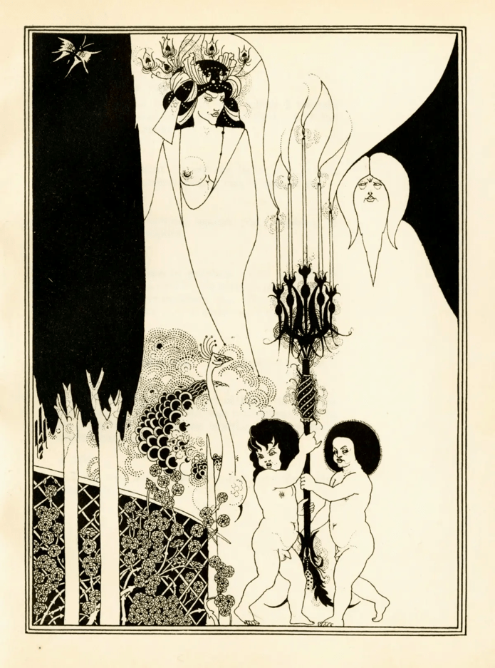
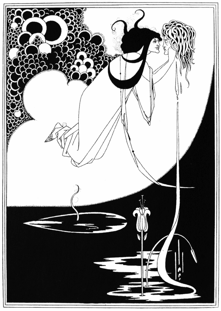
I first encountered Aubrey Beardsley in a solid red shop on Oxford’s fading high street. Amid draws of outdated maps and horticultural prints, his intricately simple woodblock prints began to creep out. Black and white visions writhed into life – their elegance tinged with irony, excess and restraint.
Within the quiet confines of Saunders of Oxford, I found myself entranced, flicking through each leaf of shocking, ironic, and playful illustrations, where line and curve dissolved into a theatre of desire and defiance. Poised between the quaint and the transgressive, my experience felt like an initiation into the strange allure of the fin de siècle.
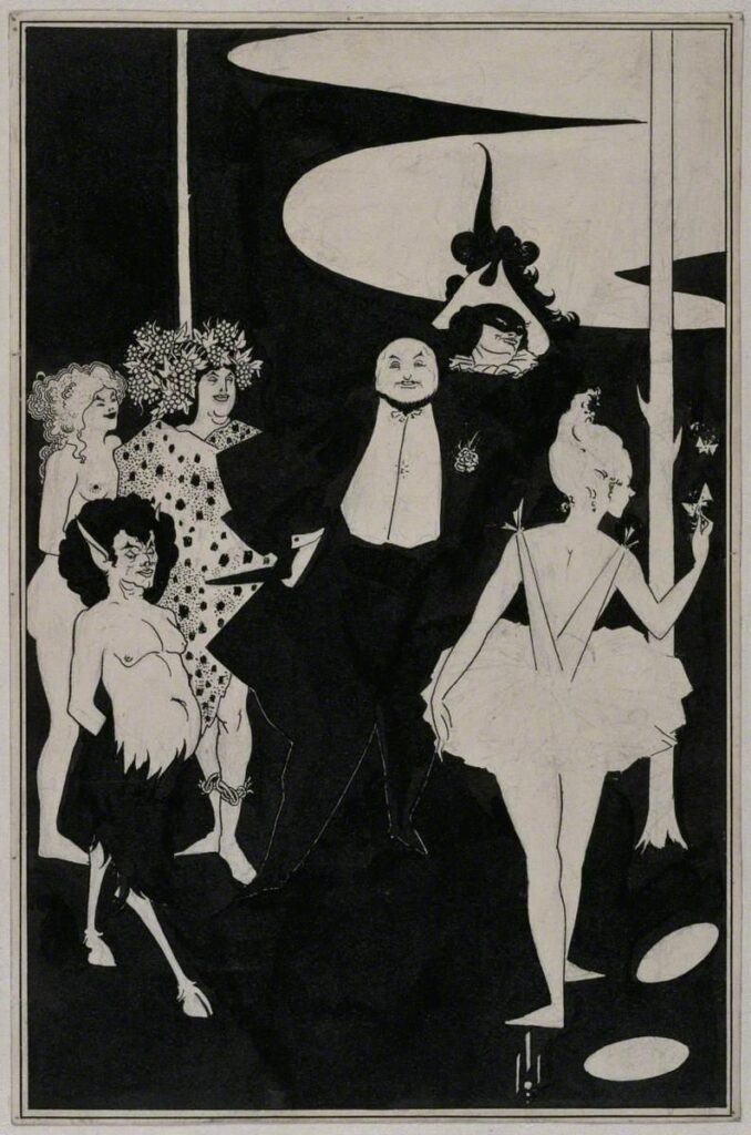
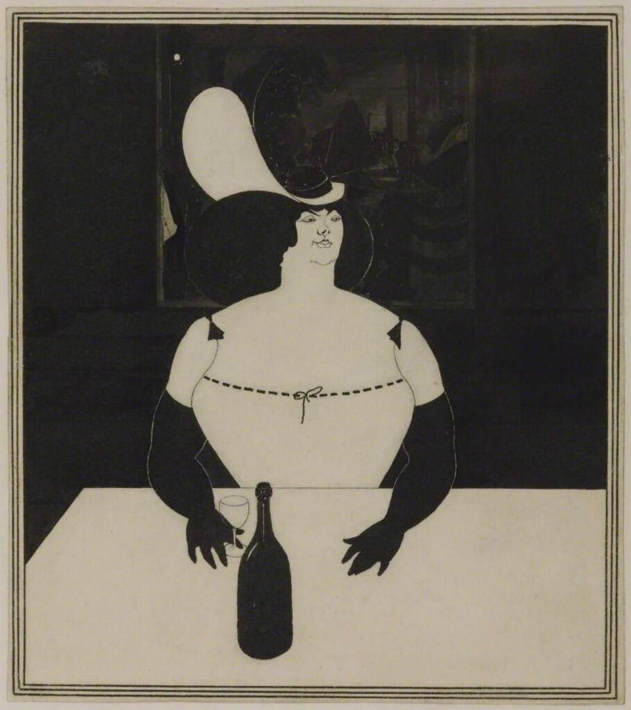
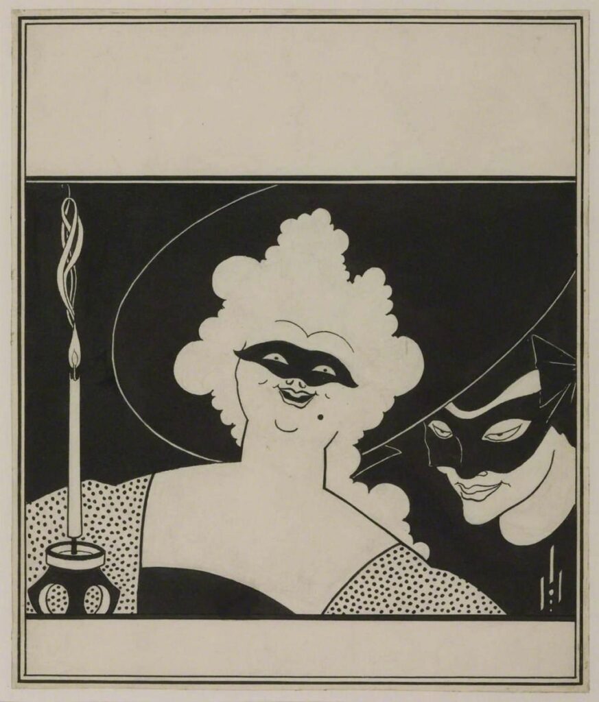
Shocking the modern viewer has become increasingly difficult in the progression of contemporary art. However, Beardsley’s fictitious illustrations snipped from Wilde’s Salomè, Thomas Malory’s Morte d’Arthur or The Savoy, left me gawking through a window into the world of Victorian England. For Beardsley, audacity was a simply humorous exercise; continuing a tradition of political and societal mockery. And as with any contentious creation, objections were, and remain, multiplicitous.
The Toilet of Salome. From: Oscar Wilde, Salome: a tragedy in one act, [2nd ed.]. London: John Lane, 1907 (facing p. 48). Collection of: Royal Academy of Arts.The Eyes of Herod, From: Oscar Wilde, Salome: a tragedy in one act, [2nd ed.]. London: John Lane, 1907 (facing p. 32). Collection of Royal Academy of Arts.
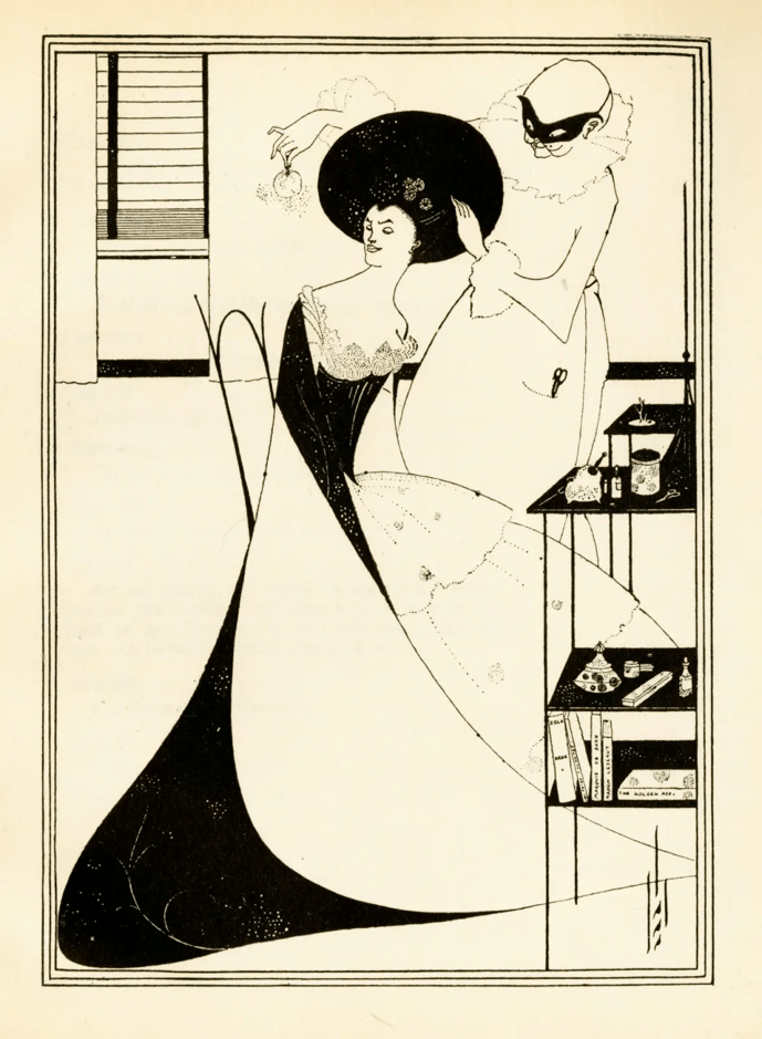
Beardsley’s grotesque, scandalous, and immoral subject matters gave him the attention he desperately desired. The bulk of his illustrations depict women, many of whom embodied deviance and corruption in the eyes of the conservative Victorian reviewer. Beardsley drew upon the taboos of the era, forming a subversive commentary on societal norms. Synchronous to his short working life, the feminist ideal of the ‘New Woman’ was salient, a term coined by the novelist, Sarah Grand, in 1894. These ‘New Women’ challenged values already being attacked by fin-de-siècle modernism and the societally deviant dandies of the Decadent movement. Women demanding social opportunities and emancipation were boxed into the same category as prostitutes or the promiscuous. Rather than attacking such unruliness, Beardsley mocks the ludicrousness of a dated categorization, gaining attention whilst revealing his progressive mindset. Despite backlash, gender was being redefined, and Beardsley harnessed such change as a platform for recognition and contentiousness.
Subversive subject matters and a tendency towards sexualised themes were often associated with his infliction of ‘consumption’ (Tuberculosis), a bizarre 19th-century perception with no medical affirmation. Ironically, with continually poor health, Beardsley turned to Catholicism and rejected his previous work on the subject.
The question of Beardsley’s own sexuality, or his advocacy for homosexuality more generally, has been debated. Despite this debate, his early death and contemporary taboos prevented any conclusions on his part. Linda Gertner Zatlin argues that he “advocated neither homosexuality, androgyny, nor heterosexuality”. Although, I would contend that his true nature or beliefs can never be uncovered, and any speculations produce no valuable theory. His work remains sexually ambiguous on a personal level, presenting us with a distinctly asexual depiction of Victorian taboos. The fluidity within his work was rare by Victorian standards, but the artist’s lack of comment on such matters reveals little of himself other than a liberal and risqué attitude. What cannot be doubted is that Beardsley was an eccentric dandy (a contemporarily mesmerising characteristic) and his confrontation of evolving issues came at a turning point in women’s and sexual history.
“I have one aim – the grotesque. If I am not grotesque, I am nothing” Aubrey Beardsley, 1897.
Beardsley initially drew inspiration from the Pre-Raphaelites, taking motivation from his desire for fame and encouraged by his mother’s expectations. He followed the works of William Morris, Dante Gabriel Rossetti, and Edward Burne-Jones. A shared interest in the medieval, symbolic subjects, as well as a rejection of contemporary art, drew Beardsley to these characters. Burne-Jones specifically acted as a mentor, strongly supporting his initial work. However, Beardsley grew tired of his Morte d’Arthur commission and the two diverged as the illustrator began to embrace his own more individualistic and increasingly erotic style. Morris held an unsupportive stance from the outset, leading to Beardsley breaking away from the Pre-Raphaelites and migrating towards a Parisian clique, further alienating British reviewers. The xenophobic normality of the late 19th-century criticised his French connections and grumbled over the otherness of his Japanese style. Nonetheless, contemporary judgment was not universally negative, and the elegance of his line and precise decorative style landed praise from several critics, including Joseph Penell.
His hard-edged line forced his work to become visually aggressive. Contradictions weave throughout, blending elegance, classicism and purity of line while meshing between the scandalous and perverse. The result is a definite visual power. The line block technique and Japanese influence remain a thread throughout Beardsley’s work, allowing for its mass reproduction at a time when printed culture was particularly prevalent. Beardsley pushed back against the self-proclaimed cultural superiority of the British art scene, lacing ironic and mocking messages into his work. In contrast, Japanese artistic practice didn’t acknowledge erotic or sexual themes in the same disgust as the Victorian Brit. Distinct parallels can be drawn both in style and motif to artists such as Kitagawa Utamaro or Katsushika Hokusai. Prints such as The Dream of the Fisherman’s Wife (Hokusai) or Lovers in the Upstairs of a Teahouse (Utamaro) portray undisguised sexualised themes far more shameless than those of Beardsley and almost a century earlier.
Irony and satire weren’t unknown to the British media, and Beardsley himself often found himself the brunt of such commentary. Beardsley and his subversive advocacy saw him riddled with salacious scandal in the eyes of Victorian England. A poem from April 1894 in Punch magazine mocked the artist in a distinctly fin-de-siècle way:
Mr Aubrey Beer de Beers, You’re getting quite a high renown; Your Comedy of Leers, You know, Is posted all about the town; This sort of stuff I cannot puff, As Boston says, it makes me “tired”; Your Japanee-Rossetti girl Is not a thing to be desired. Mr Aubrey Beer De Beers, New English Art (excuse the chaff) Is like the Newest Humour style, It’s not a thing at which to laugh; … (Owen Seaman: “Let’s Ave A Nue Poster” (Punch, 21 April 1894, p. 189))
In April 1895, two weeks following the arrest of Oscar Wilde, Aubrey Beardsley was fired from his position as art editor of The Yellow Book. Wilde was thought to be carrying a copy of the controversial periodical during his arrest. This was revealed to be simply a yellow-bound French novel, and the two men’s relationship was by now hardly amicable. However, the need to disassociate Wilde’s scandals from the periodical cost Beardsley his job. The Book’s sales fell with his illustrations no longer adorning the pages of Decadent writings. Beardsley is often associated with the life and literature of Wilde, and whilst his work depicted the society that Wilde inhabited, Beardsley’s creations hold their own gravity.
By 1898, Beardsley’s health had deteriorated. An awareness of his impending death led to his conversion to Catholicism. Before he died, he wrote to his publisher, Leonard Smithers, to dispose of his work Lysistrata and many other shocking pieces. This request, for the sake of artistic appreciation and historical study, I am glad was never completed. Aubrey Beardsley’s career spanned less than 7 years, dying of Tuberculosis in 1898. He will forever be associated with The Yellow Book, Oscar Wilde and the controversial characters of Victorian Britain’s evolving society. For those who, like me, find themselves flicking through Beardsley’s work in an antique print shop, it is evident that his work has impacted far more than just a yellow bound book.
Design for the front piece to John Davidson’s Plays, Tate.The Fat Woman, Aubrey Beardsley, Tate.