By Harry Laventure
The title “Visual Identity Review” is a prompt that no sane creature could wish to answer, let alone ruminate on.
It is also the heading for a 22-page document published by none other than the Northampton Saints rugby team as a proem to their newly unveiled logo. Once enclosed, the veritable badger may undergo frisson at a carnival of surveys and experiments curated to articulate the present plight of English domestic rugby, and the acute necessities for individual franchises to save themselves by any panacea possible. For shallow is the clock. Worcester Warriors, London Wasps, and London Irish have already been disposed of alongside the superfluous bloats of PPE; Leicester Tigers and Exeter Chiefs both groped at cash inoculations to survive the pandemic’s debilitations. Precious few of the teams that remain operate at a profit.* As the Saints’ investigation itself purports, less than 1/3 of people can name a Premiership club. Although rugby union is the fourth most followed sport in the country, it doesn’t even make the Top 20 for Gen Z (EY Sports Engagement Index, Nov. 2023). It is perhaps a set of studs rammed to the begging hand to note that one of the larger surveys within the report only garnered 1611 responses. Thus Webb-Ellis’ great game of rough football with fingers wheezes.
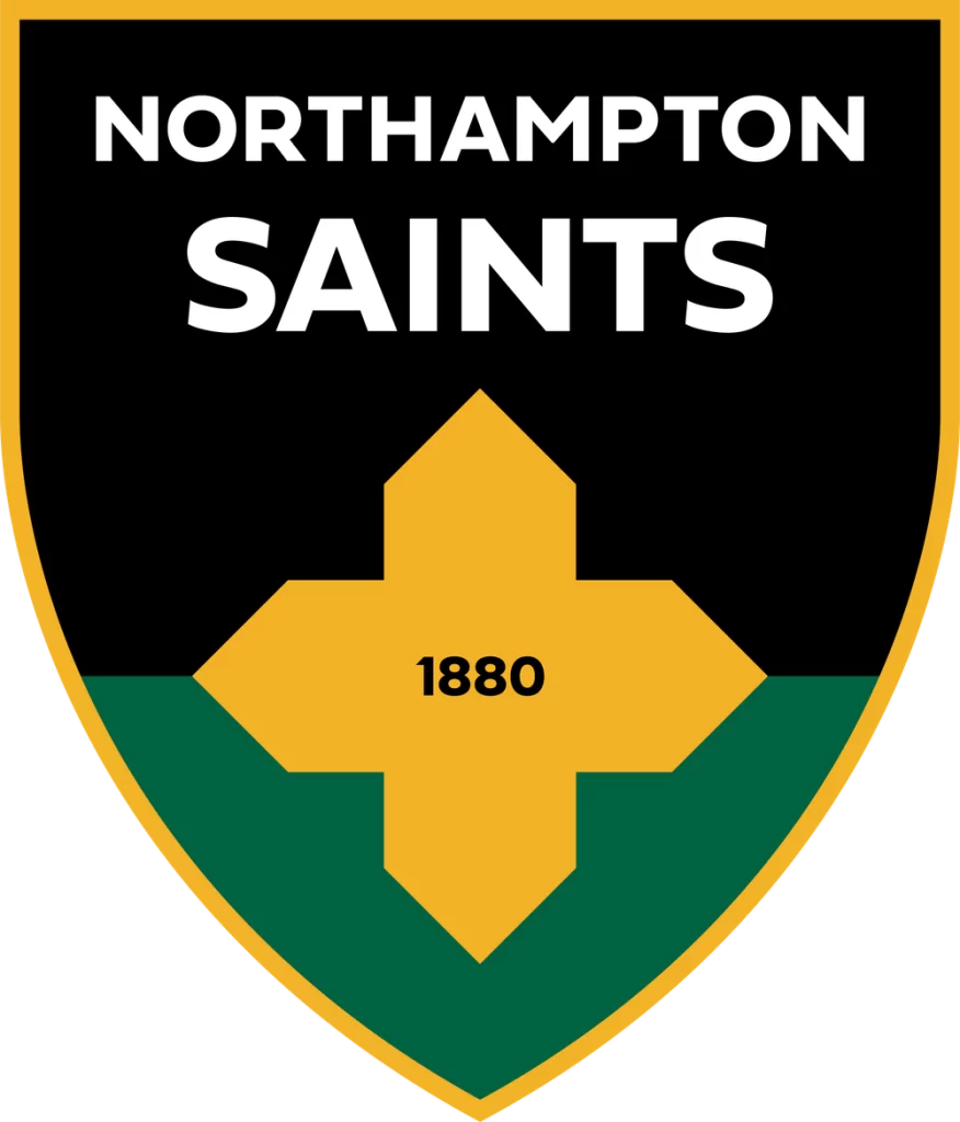
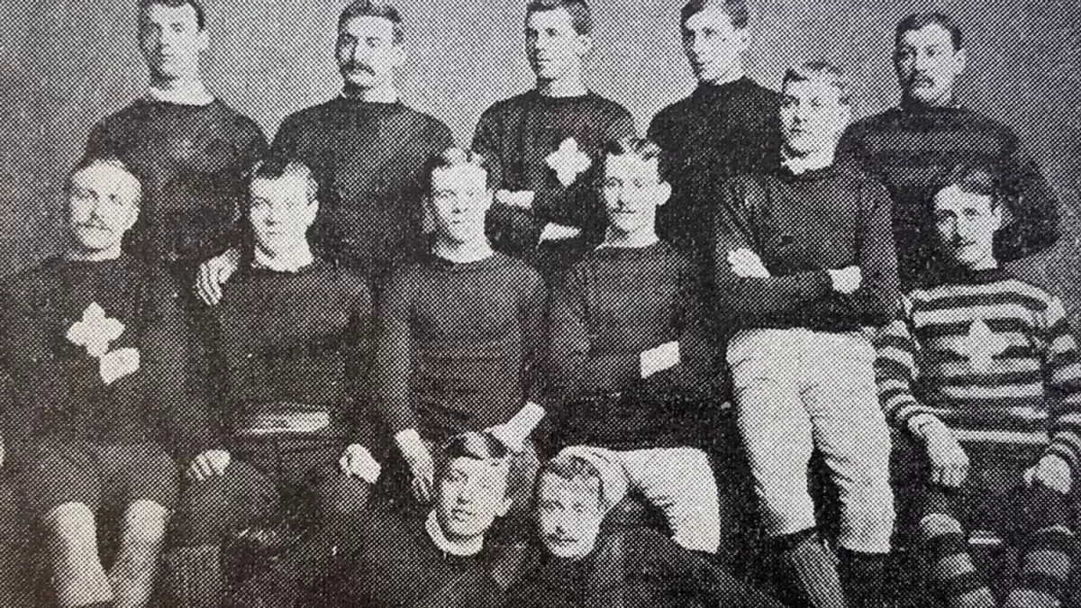
In their hour of need, the Saints have built a new cross: a modernised logo. As an appeal to the digital vernacular, the much-simplified shield posits a daffodil yellow skeleton of St. James’ crux to straddle bands of ebony and Heineken green. As such, Northampton recalibrate to align themselves with every sporting franchise from Juventus to the New York Yankees (cited precisely in the report as examples of efficacious branding) in the sleek, sterile new era. Charmingly, the cross itself is derived from the teamwear in the oldest pictures we have of the then St. James Improvement Class, 1884. It is this detail, declares the club, that permits the memory of forefathers whilst preserving the blood for generations of technophants to come. Alas, for this writer, the cost of lost alleles eclipses the cosmetic.


Images courtesy of the Northampton Saints website
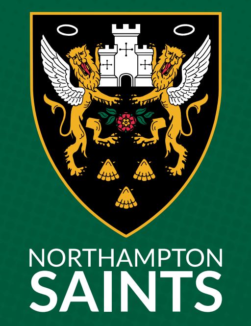
A brief twig of aesthetic genealogy. In 1880, a reverend with the nominal bristle of Samuel Wathen Wigg founded the Improvement Class of his St. James Church. Between then and 1951, the Improvement Class would become the Britons, and the Britons would become the Saints, with accompanying palette changes of scarlet strips to the present black, green, and gold. From chrysalis to adult, the team’s students designed arms for their blazers that would endure to this very year. The Northampton Borough heraldry of 1617 was their starting whistle: two lions grin rampant guardant with the proud symmetry of a Dragontail, between them the solitary turret of Northampton Castle. To this, the students added nimbs, wings, the crimson rose of Northamptonshire, and a trinity of scallop shells. In doing so, they demonstrated erudition and tact that is not usually – unfairly – associated with the muddy foot soldiers of fifteen. Indeed, there is density in the detail. Beyond the elements that made saints out of lions, the scallop shells not only refer symbolically to St. James but tap into the heraldic legacy of the Spencer family, who have historically resided in the nearby Althorp Estate. In this fashion, to poach from Burnett and Dennis, ‘fact and fancy, myth and manner, romance and reality’ enjoy exuberant union within a small patch. A grandiose castle of around 1100 CE finds its rhyming couplet with the sketched halos of post-WWII students. Between history’s pomp and shrapnel, there is plucked taut the golden thread of a place eternal and changing. This is the story of all heraldry, and the martyrdom to which it has glumly plodded for the best part of two centuries is painfully indicative of a recent malady in our attitudes to communication.

Image courtesy of the Northampton Saints website
The Old French hiraudie (deriv. Frankish, Hariwald) animates the imagery of chivalry and other anachronisms by association and fact. A form of identification card for the budding noble combatant, the home-and-away strip of knightly tournaments provided a defensive canvas for the exhibition of lineage, location, and claimed attribute. It is this vast well of opportunity in expression, aesthetic and figurative, that made heraldry a kind of practical art. The bolster of the aristocrat becomes the banner of the company – a charring claim to individuality in the collective of the militant mind. It is a cheap trick of the tongue to note the importance of a topic by citation of its own scholarship, but humour me to direct you towards the contents of Richard Blome’s 1685 The Art of Heraldry. From bordures charged to labells, ineschocheons to orles, fesses to celestials, and four chapters dedicated to the different postures and parts of lions, it reads more like the ingredients list for amateur incantations than history of art. This visual zest has rendered the topic the branding of childhood lessons on medieval England – the de facto décor of the veteran history teacher. Indeed, it seems only yesterday that I charged down Senlac Hill (the mound of our cricket pavilion) under the handled pinion of Normandy’s double lions. But of heraldry, alas, history has not made a victor. Perhaps it is now the moment to calculate why.
Not just yet. An entertaining but relevant digression comes in G.K. Chesterton’s The Defendant (1901). Nestled between the obdurate esteem of Baby Worship, Nonsense, and China Shepherdesses, the writer finds a nook to document the unfortunate denouement of heraldry in his (now our) times. In light of the newly-ruled illegitimacy of God’s nominated representatives, Chesterton argues, the rhetoric becomes more about dragging down the elite than aspiring to conduct oneself by the expectations of their ranks. So the ‘road from the eye to the heart that does not go through the intellect’ becomes one not taken, in an ironic inflection of snobbishness. The tobacconist finds not a shield for his crossed briar pipes; the cheesemonger no war-cry of Wensleydale. The pictorial ‘suggestion, without naming or defining is rendered extravagance’. And men may argue over the ‘wittiest thing about the spring’ that is theirs to inherit, rather than serve. Indeed, Chesterton proposes that it is the continued use of heraldry that permits pubs to exercise their continued, mysterious attraction (…). How easily nostalgia binds itself to English ink. But not entirely off the mark.
Now, then. Take a gander at the ludicrous excess of the Coat of arms of Baldomero Espartero, Prince of Vergara (1793–1879). Even in an extravagant art form, there are extravagances. Artefacts like this smoothly demonstrate what it means for any piece of art to be imbalanced away from us. It is needlessly overwhelming in what it tries to throw all at once, expecting us not to drop the ball for a moment’s lack of subtext. A reaction of eye-rolling dismissal is not only natural, but justifiable. Because it is natural, it seems right. We are always quicker to note that which inconveniences us. Something that requires more discipline to spot is the imbalance of art at our service, or worse, mercy. That which curries our favour without asking for any form of participation in return is little more than a sycophant’s counsel. I am describing the modern phenomenon of branding. By definition, it is designed to pamper and pander to the lazier instincts of our faculties. Obviously, its only purpose is the successful and swift achievement of your investment. All else is irrelevance – for why would any vendor rely on his customer’s capacity for active evaluation of their product? Neither true commerce, nor free creative expression, heraldry lacks the poise to find a habitat in this landscape. Here we see the true inhospitality of our epoch.
Duchamp once considered the concept of real artistic meaning as the electrified space between a transmitter (artist) and receiver (audience). At its worst, the martyrdom of heraldry is the parable of a collapse in this traditional mode of exchange. Catalysed by the online medium and the general disenfranchisement of the public on the back of the modern era’s artistic experiments, both sides have failed to keep their perfect tension. To reconfigure to a new (but very, very old) image of the Caduceus, the serpents have lost their rhythm with one another. One, gluttonous and slow, waits to be anaesthetised repeatedly by the fangs of a hyperactive other. In the resultantly anharmonic heap, the golden rod has no centrifuge to hold its salute. This is that space between, and it fell with little more than a metallic twang.
Possibly, the true cynic could go further still. In the traditional mode of doom-mongering, they would suggest that the corrosive attitude bred by the casual proliferation of these commercial transactions is a septic tank slowly bleeding into the water supply. Moreover, you can read it in the disposable nonchalance and sterility of this generation’s architecture, infrastructure, art, and literature. And we might consider the sanding down of ornate Parisian lampposts to the aluminium and glass cuboids of central New York. They may even direct you to a Tiktok contrasting the cornices of Schönbrunn with the tubing of the Centre Pompidou. Rising skirt hems, lowering IQs, and things just aren’t built like they used to be. Let us not stumble into satire with no interesting point but laughter. Here sleaze numerous conflations and generalisations, but the questions they elicit are not entirely unrelated to our symposium. Woven as the theme is with strands of pessimistic nostalgia, I do not think that the commercial tectonics dictating art’s place in our lives have been entirely without condescension as of late. Conf. Banksy. When was the last time you saw a piece of contemporary art that was neither blatant nor untenable to you? Harsh, but fair. Fragrances of these ponders are relevant, others are ludicrous. For now, this punter backs away burnt, and concedes that perhaps the more grandiose abstractions of enquiry are for now to remain like the impacts of the French Revolution. Too soon to say.
In this mess of pretence, it’s easy to forget that we started on the logo of the Northampton Saints rugby team. If we cannot put the artistic atmosphere of our times to rights over this dilettante’s aperitif, we may at least try to reconcile our introduction. It is a shame, but after all that I do feel we must concede that the Saints’ metamorphosis is evidence of evolution in the truest sense: a shot at survival. Practicalities must, and there is no space for the detailing of a centuries old crest in a profile pic. As mentioned earlier, there are fond anecdotes of the Reverend Wigg’s wife knitting the very same cross of the new logo on the St. James’ Improvement Class teamwear. This essence of approach, regardless of execution, should be admirable to the dustiest of Earl Marshals.
As for heraldry more generally, it seems all too sadly obvious. In the mid-19th century, Somerset Herald James Robinson Planché despaired to admit that it had been called ‘the science of fools with long memories’. Fond as I am, it now appears self-evident that the truest mystery of any cult’s rites exists only for those already initiated. But this panegyric must refuse to conclude in this key centre. Instead, we may remark that heraldry’s finest lessons and attributes survive in whispers, too subtle in their blatancy to offend. Men still do not ‘argue over the meaning of sunsets’. From the blood-peppered fork of the Zulfiqur, to the three (preferably beer-marinated) lions of an England shirt, the most formidable banners of our histories will survive us. And so, let the obituary conclude with a new definition. One of my favourite poets once determined his work as ‘the movement of a self in the rock’. Surely, if nothing else, this ditty has proven heraldry to be none other than ‘the aspiration of ourselves in the rock’.
*Since this article was written (12th August), seven of the ten Premiership teams have declared that they are balance sheet insolvent.

