Categories
Culture

Artist in Spotlight: Georges Charles Robin, 1903-2002

By Harry Laventure

Of late (and wherefore I know not), the grand movements of art history have found new determinisms. In this epoch of images, we the pedestrians have more exposure than ever before to any piece of art we desire. The dosage we receive is no longer at the behest or prescription of authenticated scholars, nor does it come with labels attached. Indeed, it is no stretch to say that our eyes can outrun the footfall of any Grand Tourist of old within moments. As such, the established nomenclature for movements of art have lost their gravitas, and we are more often – without further, deliberate investigation – to make our minds of what we see without clues. As such, large strokes of Baroque, Renaissance, and Mannerist art becomes “Italian, religious art”. Post-war abstract expressionists are the “my-children-could-do-thats”. Perhaps the cruellest public treatment has come to the Impressionists and their immediate successors. Victims of their own vanquishing, they are the “chocolate box artists”; the postcard landscapes; the wallpaper poltergeists. 

From this clientele, there remains no doubt an ostentation of mellifluously French names in the vocabulary of the everyman: Monet, Renoir, Cezanne, Van Gogh (perhaps less French). Those who made totems of waterlilies, umbrellas, apples, and sunflowers have been rewarded with a lasting fame, fresh to the market and gallery alike. Among these heavyweights, one name you may not be so familiar with is Georges Charles Robin. Having spent a week in the company of his oeuvre, I’d like to present his case. 

Georges Charles Robin (“row-ban” rather than the red-breasted variety) was born in Paris, 1903. Although little is known of his early life and artistic education, his natural gift is unmistakable: Robin began as scenery artist for the Charleville Theatre, and the Dinan Casino. In his lifetime as an artist proper, however, his canvas would play host to several locations that were luminaries of his living arrangements. Among them, Rueil Malmaison’s more salubrious panoramas, Morlaix’s summer blooms, and the rivulets that etch the contours of the Loire Valley and the Dordogne region. More often championed for his rural than urban works, there is no pomposity or material opulence to his corpus: it was serenity rather than salon that formed his locus amoenus, and his delicate muses are to be found in the ornately rustic realm. Robin would live to his hundredth year, having become a member of innumerable French artistic societies, officer of the Académie des Beaux Arts, director of the Institute of “Instruction Publique”, and been decorated by the Hors Concours amidst countless other French art awards. In spite of this remarkable bundle of ribbons and statistics, Robin continues to be widely absent from the history books, and by extension the public memory. 

It is perhaps, after all, too easy for a man of subtlety to be lost in the parade of caricatures and radicals that preceded him. Indeed, one interesting thing about the repurposing of the Impressionist sunset for the tablecloth is the newfound quietude. Synchronically, we cannot understand the movement as anything less than an artistic equivalent of violent revolution. The late 19th/early 20th century assault in all its anti-classical insouciance was one of style and sentiment. As the art world’s establishments wept for the death of academicism in a few swift splodges of colour against total realism, new precedents were set by artists of immense impact devoid of certification. Principles of belonging as imposters have governed the art world since. And yet, if careless, one can break free from prison to find himself unemployed. Inheriting this debris, the sensible man asks what should be done, rather than what could be done. As one who was forged in this particular bain-marie, that is precisely what Robin did. 

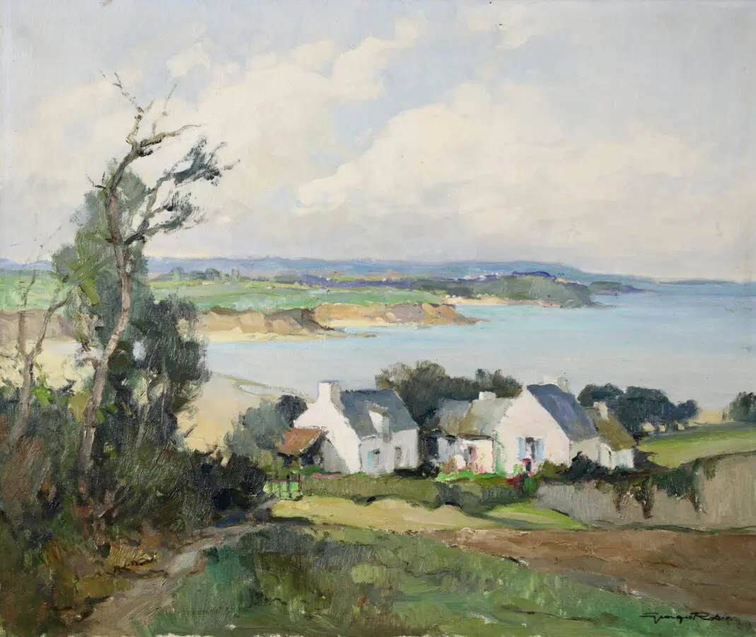
And how we may read it on the canvas. Take his Bords du Loir, a delightfully tranquil scene: as we look up from the crystalline, stilled embrace of a river, speckles of figures bumble across an arched stone bridge, towards a cluster of sun-breathed buildings. Cypresses line the riverbank like emerald quills, and a bouquet of soft blues tangle with ivory clouds above. A rowing boat lays matchstick-like at the edge of the water, without an oarsman – perhaps they too have stopped to watch? There is nothing bombastic about the painting. On the contrary, the gentle dynamism of the brushwork makes shimmers of the scene, as if the most delicate of breezes would leave the canvas and its cast tremulous. This is no outlier – the very same is observable in my personal favourite, L’Eglise de Montrozier sur L’Aveyron. An altogether similar arrangement, but an opportunity to note his alacrity for tremors in the dust path we walk along to church, and survey Robin’s capacity for reflection in a stream that is neither too exact as to be false, nor murky to be unfaithful. His Impressionist forefathers found the limits of what could reasonably be done on a canvas in an anti-traditional fashion. Robin, however, refines the achievements of these predecessors rather than continuing their experiments. 

In no facet of his work is this more blatant than in his attitudes to palette. Firstly, if one takes numerous Monet or Pissarro works, there is a deliberate lean towards the psychedelic in normal subject matter. Whether in a congregation of flowers from the gardens of Giverny or a nocturnal Parisian street scene, there is a hunt for a kind of pyrotechnics in paint on the canvas. Likewise in Robin’s contemporaries Pierre Montézin and Edouard Cortès, fireworks of pinks and blues pollinate every pore of the picture, resulting in kaleidoscopic spectra in subjects as ostensibly simple as stacks of hay. Contrast this with the restrained palette of Robin’s paintings above, and you gain efficient insight into his mentality. As expert Anthony Fuller of Gladwell & Patterson’s Gallery puts it, ‘the juxtaposition of each colour softens them, and they have a quiet richness’. The precise colours of a moment are each fragmented into shades that differ with such minute playfulness as to leave every atomic subcategory as individual notes within grand chords. The resultant cadence is profound in a way that rewards rather than grapples your focus. 

Further still, as a variation on the theme, the likes of Hassam and Suzor-Coté were castigated for their use of colours that had a fidelity to the ‘impression’ of a scene, if not its true likeness. This is most notorious in the manner that indigos and violets cling to their snow scenes: whilst it is perhaps true that the cocktail of sunlight and glacial blue renders a purple sensation for the viewer, this does not change the true colour of each constituent parts. (There is a lingering debate on truth, imitation, and likeness which I do not have room to sink my paws into here, perhaps another time). Robin, on the other hand, does not have to ‘adopt’ colours to fit a scene – they are the shades indigenous to a given subject. Nowhere is this more obvious than in La Seine à Bougival, Le Soir. Bruising is reserved for the sky, and flour white for the snow. All is coherent, none is superimposed. A cunning and useful symbol: amidst all the fog of this wintery nocturne, every vague angle of the composition draws our eyes to the path ahead and the peppery figures opposite who walk towards us, arm in arm. Each Robin requires the sincere attention to surroundings that one enjoys on a nightly stroll. He does not demand your eyes, but a glance is a tip of the hat. To indulge them proper is to participate – that is your choice. 

This subtlety, and the humble worship of that nature which has been documented for centuries, devoid of grandiosity or party tricks, is Robin’s greatest success. A rare sincerity reserved for the too oft ignored in the everyday. Alas, it is also probably the reason why you haven’t heard of him. 

This week just gone, I had the privilege of helping Gladwell & Patterson set up their new gallery in Stamford, Lincolnshire. Part of this privilege was unadulterated time to chew the cud on all things Robin with Anthony, son of Herbert Fuller, the man who discovered him. Anthony is as joyous as he is erudite on Robin, and he patiently endured a barrage of questions from me – for this I will always be grateful. Moreover, he enjoys a masterfully intimate command of the technicalities involved therein, and can reanimate the artistic mechanics behind each piece with accuracy far beyond these little jottings of mine. Anthony has long insisted that Georges Charles Robin is an artist of tomorrow. I happen to agree. 

Since Covid, the art market has seen an unprecedented shift towards Post-War, Modern, and Contemporary movements, which last year accounted for 77% of sales (by value) within auction houses. Beyond the pomp and gimmick of shredding frames and falling buckets of sand, may we hope to relearn the art of looking without the need for active stimulation. When we do, sincerity will await us like a bit of peace and quiet after a tube ride. Free from chocolate box prints, and dusted off for due attention, Georges Charles Robin will be there. 

Categories
Culture

Martyrdom for a Banner: Heraldry, Heritage, and the Northampton Saints

By Harry Laventure

The title “Visual Identity Review” is a prompt that no sane creature could wish to answer, let alone ruminate on.

It is also the heading for a 22-page document published by none other than the Northampton Saints rugby team as a proem to their newly unveiled logo. Once enclosed, the veritable badger may undergo frisson at a carnival of surveys and experiments curated to articulate the present plight of English domestic rugby, and the acute necessities for individual franchises to save themselves by any panacea possible. For shallow is the clock. Worcester Warriors, London Wasps, and London Irish have already been disposed of alongside the superfluous bloats of PPE; Leicester Tigers and Exeter Chiefs both groped at cash inoculations to survive the pandemic’s debilitations. Precious few of the teams that remain operate at a profit.* As the Saints’ investigation itself purports, less than 1/3 of people can name a Premiership club. Although rugby union is the fourth most followed sport in the country, it doesn’t even make the Top 20 for Gen Z (EY Sports Engagement Index, Nov. 2023). It is perhaps a set of studs rammed to the begging hand to note that one of the larger surveys within the report only garnered 1611 responses. Thus Webb-Ellis’ great game of rough football with fingers wheezes.

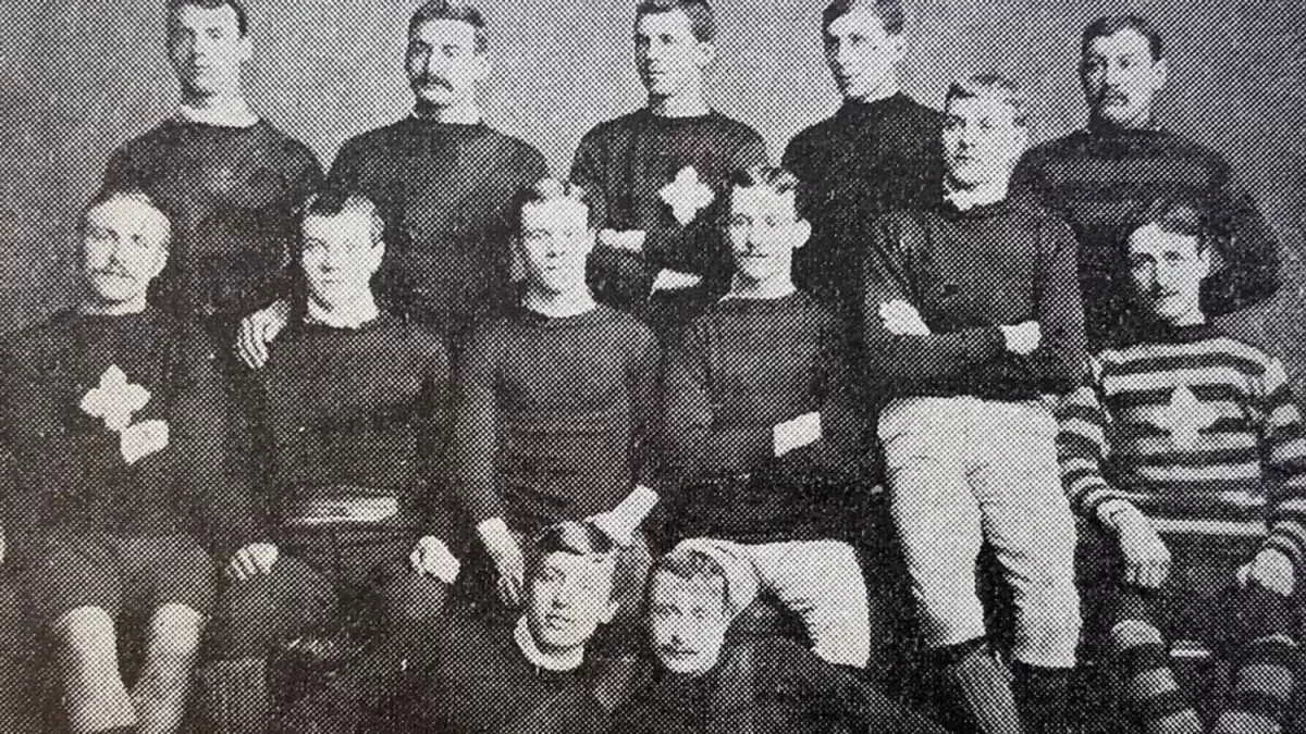
In their hour of need, the Saints have built a new cross: a modernised logo. As an appeal to the digital vernacular, the much-simplified shield posits a daffodil yellow skeleton of St. James’ crux to straddle bands of ebony and Heineken green. As such, Northampton recalibrate to align themselves with every sporting franchise from Juventus to the New York Yankees (cited precisely in the report as examples of efficacious branding) in the sleek, sterile new era. Charmingly, the cross itself is derived from the teamwear in the oldest pictures we have of the then St. James Improvement Class, 1884. It is this detail, declares the club, that permits the memory of forefathers whilst preserving the blood for generations of technophants to come. Alas, for this writer, the cost of lost alleles eclipses the cosmetic.

Images courtesy of the Northampton Saints website

A brief twig of aesthetic genealogy. In 1880, a reverend with the nominal bristle of Samuel Wathen Wigg founded the Improvement Class of his St. James Church. Between then and 1951, the Improvement Class would become the Britons, and the Britons would become the Saints, with accompanying palette changes of scarlet strips to the present black, green, and gold. From chrysalis to adult, the team’s students designed arms for their blazers that would endure to this very year. The Northampton Borough heraldry of 1617 was their starting whistle: two lions grin rampant guardant with the proud symmetry of a Dragontail, between them the solitary turret of Northampton Castle. To this, the students added nimbs, wings, the crimson rose of Northamptonshire, and a trinity of scallop shells. In doing so, they demonstrated erudition and tact that is not usually – unfairly – associated with the muddy foot soldiers of fifteen. Indeed, there is density in the detail. Beyond the elements that made saints out of lions, the scallop shells not only refer symbolically to St. James but tap into the heraldic legacy of the Spencer family, who have historically resided in the nearby Althorp Estate. In this fashion, to poach from Burnett and Dennis, ‘fact and fancy, myth and manner, romance and reality’ enjoy exuberant union within a small patch. A grandiose castle of around 1100 CE finds its rhyming couplet with the sketched halos of post-WWII students. Between history’s pomp and shrapnel, there is plucked taut the golden thread of a place eternal and changing. This is the story of all heraldry, and the martyrdom to which it has glumly plodded for the best part of two centuries is painfully indicative of a recent malady in our attitudes to communication.

Image courtesy of the Northampton Saints website

The Old French hiraudie (deriv. Frankish, Hariwald) animates the imagery of chivalry and other anachronisms by association and fact. A form of identification card for the budding noble combatant, the home-and-away strip of knightly tournaments provided a defensive canvas for the exhibition of lineage, location, and claimed attribute. It is this vast well of opportunity in expression, aesthetic and figurative, that made heraldry a kind of practical art. The bolster of the aristocrat becomes the banner of the company – a charring claim to individuality in the collective of the militant mind. It is a cheap trick of the tongue to note the importance of a topic by citation of its own scholarship, but humour me to direct you towards the contents of Richard Blome’s 1685 The Art of Heraldry. From bordures charged to labells, ineschocheons to orles, fesses to celestials, and four chapters dedicated to the different postures and parts of lions, it reads more like the ingredients list for amateur incantations than history of art. This visual zest has rendered the topic the branding of childhood lessons on medieval England – the de facto décor of the veteran history teacher. Indeed, it seems only yesterday that I charged down Senlac Hill (the mound of our cricket pavilion) under the handled pinion of Normandy’s double lions. But of heraldry, alas, history has not made a victor. Perhaps it is now the moment to calculate why.

Not just yet. An entertaining but relevant digression comes in G.K. Chesterton’s The Defendant (1901). Nestled between the obdurate esteem of Baby Worship, Nonsense, and China Shepherdesses, the writer finds a nook to document the unfortunate denouement of heraldry in his (now our) times. In light of the newly-ruled illegitimacy of God’s nominated representatives, Chesterton argues, the rhetoric becomes more about dragging down the elite than aspiring to conduct oneself by the expectations of their ranks. So the ‘road from the eye to the heart that does not go through the intellect’ becomes one not taken, in an ironic inflection of snobbishness. The tobacconist finds not a shield for his crossed briar pipes; the cheesemonger no war-cry of Wensleydale. The pictorial ‘suggestion, without naming or defining is rendered extravagance’. And men may argue over the ‘wittiest thing about the spring’ that is theirs to inherit, rather than serve. Indeed, Chesterton proposes that it is the continued use of heraldry that permits pubs to exercise their continued, mysterious attraction (…). How easily nostalgia binds itself to English ink. But not entirely off the mark.

Now, then. Take a gander at the ludicrous excess of the Coat of arms of Baldomero Espartero, Prince of Vergara (1793–1879). Even in an extravagant art form, there are extravagances. Artefacts like this smoothly demonstrate what it means for any piece of art to be imbalanced away from us. It is needlessly overwhelming in what it tries to throw all at once, expecting us not to drop the ball for a moment’s lack of subtext. A reaction of eye-rolling dismissal is not only natural, but justifiable. Because it is natural, it seems right. We are always quicker to note that which inconveniences us. Something that requires more discipline to spot is the imbalance of art at our service, or worse, mercy. That which curries our favour without asking for any form of participation in return is little more than a sycophant’s counsel. I am describing the modern phenomenon of branding. By definition, it is designed to pamper and pander to the lazier instincts of our faculties. Obviously, its only purpose is the successful and swift achievement of your investment. All else is irrelevance – for why would any vendor rely on his customer’s capacity for active evaluation of their product? Neither true commerce, nor free creative expression, heraldry lacks the poise to find a habitat in this landscape. Here we see the true inhospitality of our epoch. 

Duchamp once considered the concept of real artistic meaning as the electrified space between a transmitter (artist) and receiver (audience). At its worst, the martyrdom of heraldry is the parable of a collapse in this traditional mode of exchange. Catalysed by the online medium and the general disenfranchisement of the public on the back of the modern era’s artistic experiments, both sides have failed to keep their perfect tension. To reconfigure to a new (but very, very old) image of the Caduceus, the serpents have lost their rhythm with one another. One, gluttonous and slow, waits to be anaesthetised repeatedly by the fangs of a hyperactive other. In the resultantly anharmonic heap, the golden rod has no centrifuge to hold its salute. This is that space between, and it fell with little more than a metallic twang.

Possibly, the true cynic could go further still. In the traditional mode of doom-mongering, they would suggest that the corrosive attitude bred by the casual proliferation of these commercial transactions is a septic tank slowly bleeding into the water supply. Moreover, you can read it in the disposable nonchalance and sterility of this generation’s architecture, infrastructure, art, and literature. And we might consider the sanding down of ornate Parisian lampposts to the aluminium and glass cuboids of central New York. They may even direct you to a Tiktok contrasting the cornices of Schönbrunn with the tubing of the Centre Pompidou. Rising skirt hems, lowering IQs, and things just aren’t built like they used to be. Let us not stumble into satire with no interesting point but laughter. Here sleaze numerous conflations and generalisations, but the questions they elicit are not entirely unrelated to our symposium. Woven as the theme is with strands of pessimistic nostalgia, I do not think that the commercial tectonics dictating art’s place in our lives have been entirely without condescension as of late. Conf. Banksy. When was the last time you saw a piece of contemporary art that was neither blatant nor untenable to you? Harsh, but fair. Fragrances of these ponders are relevant, others are ludicrous. For now, this punter backs away burnt, and concedes that perhaps the more grandiose abstractions of enquiry are for now to remain like the impacts of the French Revolution. Too soon to say. 

In this mess of pretence, it’s easy to forget that we started on the logo of the Northampton Saints rugby team. If we cannot put the artistic atmosphere of our times to rights over this dilettante’s aperitif, we may at least try to reconcile our introduction. It is a shame, but after all that I do feel we must concede that the Saints’ metamorphosis is evidence of evolution in the truest sense: a shot at survival. Practicalities must, and there is no space for the detailing of a centuries old crest in a profile pic. As mentioned earlier, there are fond anecdotes of the Reverend Wigg’s wife knitting the very same cross of the new logo on the St. James’ Improvement Class teamwear. This essence of approach, regardless of execution, should be admirable to the dustiest of Earl Marshals.  

As for heraldry more generally, it seems all too sadly obvious. In the mid-19th century, Somerset Herald James Robinson Planché despaired to admit that it had been called ‘the science of fools with long memories’. Fond as I am, it now appears self-evident that the truest mystery of any cult’s rites exists only for those already initiated. But this panegyric must refuse to conclude in this key centre. Instead, we may remark that heraldry’s finest lessons and attributes survive in whispers, too subtle in their blatancy to offend. Men still do not ‘argue over the meaning of sunsets’. From the blood-peppered fork of the Zulfiqur, to the three (preferably beer-marinated) lions of an England shirt, the most formidable banners of our histories will survive us. And so, let the obituary conclude with a new definition. One of my favourite poets once determined his work as ‘the movement of a self in the rock’. Surely, if nothing else, this ditty has proven heraldry to be none other than ‘the aspiration of ourselves in the rock’.

*Since this article was written (12th August), seven of the ten Premiership teams have declared that they are balance sheet insolvent.

Categories
Culture

Bruckner’s Symphonic Contract with God 

Feierlich, Misterioso

By Harry Laventure

Solemnly, mysterious etch the brackets into which we are hemmed in the opening sears of the first movement. Violins buzz with the tremors of dust disturbed in the prelude of a tempest’s caprice, and call the calling of sombre fanfare. Thus the brass asserts itself above the tremolo in forceful simplicity, and therein the inscribed syllables of loft find their reciprocal: the nod of a bull before the altar’s slaughter. Forgive the Classicist his unimaginative vices, but there is something of Homeric grandeur in this sonic landscape. The twin rumble of drums are hammers to the battlelines, and we are sealed in amidst the scattered promises and declarations of an uncanny hero’s ambition. Our tension is permitted a woodwind reverie of gasping brevity, a bouquet of memories before commencement. We hear what it is to soar in the vignettes of a past well spent, spliced with shots of remorse too thrifty. Then comes the surge, at the mercy of a rolling wave’s architecture: from the raging torrent swells some dark god – the conductor himself? – and with it the orchestra is electrified into a monument of raw majesty, blasting thunderous bolts of assault on the ear in ruthless succession. Paralysis of megalophobia, to coin a phrase. Under these auspices does Bruckner begin his theological wrestling match: the unfinished Symphony No.9 in D minor.

Some forty-five minutes earlier, I had disembarked at Newcastle station. Abiding thematic etiquette, the fragrance of a fashion show induced hangover had left me feeling penitent. Indeed, advancing on the refractive armadillo of The Glasshouse at Gateshead by afternoon sunlight, I mused that perhaps this was the only way to appreciate a work written on the composer’s death bed. Macabre remarks aside, I had never visited the International Centre for Music; I was quite shocked to find such a titanic figure perched like an enormous silver hippopotamus enjoying a river tipple. Changing its name from The Sage in 2022, the £70,000,000 project was built in 2004, and houses a small rehearsal and performance space, a 450-seater, and a 1,700-capacity auditorium. The latter of these formed the arena for the afternoon’s concert – the third day of The Glasshouse’s Big Bruckner Weekend in celebration of his 200thbirthday. 

A true centurion of the concert hall, my grandfather had attended all three days, witnessing the Royal Liverpool Philharmonic’s take on Bruckner’s 7th (“quirky”), the Hallé’s portrayal of his 8th (“breathtaking”), and the Royal Northern Sinfonia’s performance of his ‘Great’Mass No.3 (“quite staggeringly beautiful”), to name the party pieces. Whilst we enjoyed a sobering glass of elderflower, I surveyed the belly of this beast to the soundtrack of three of Bruckner’s motets, live. Bar the occasional jolt of ground coffee belted from its chamber, a reverential silence cascaded upon the open-plan café and restaurant as we were serenaded by the Royal Northern Sinfonia’s chorus. The acoustics cradled the gentle cadences of these chapel-sized blooms, and the delicate parhelia of technicolour lights above provided fitting aesthetic symmetry. It was moving in a soft way, and quite unlike the rip-roaring blasts of the symphony to come. A composer of measure, I chortled to myself. 

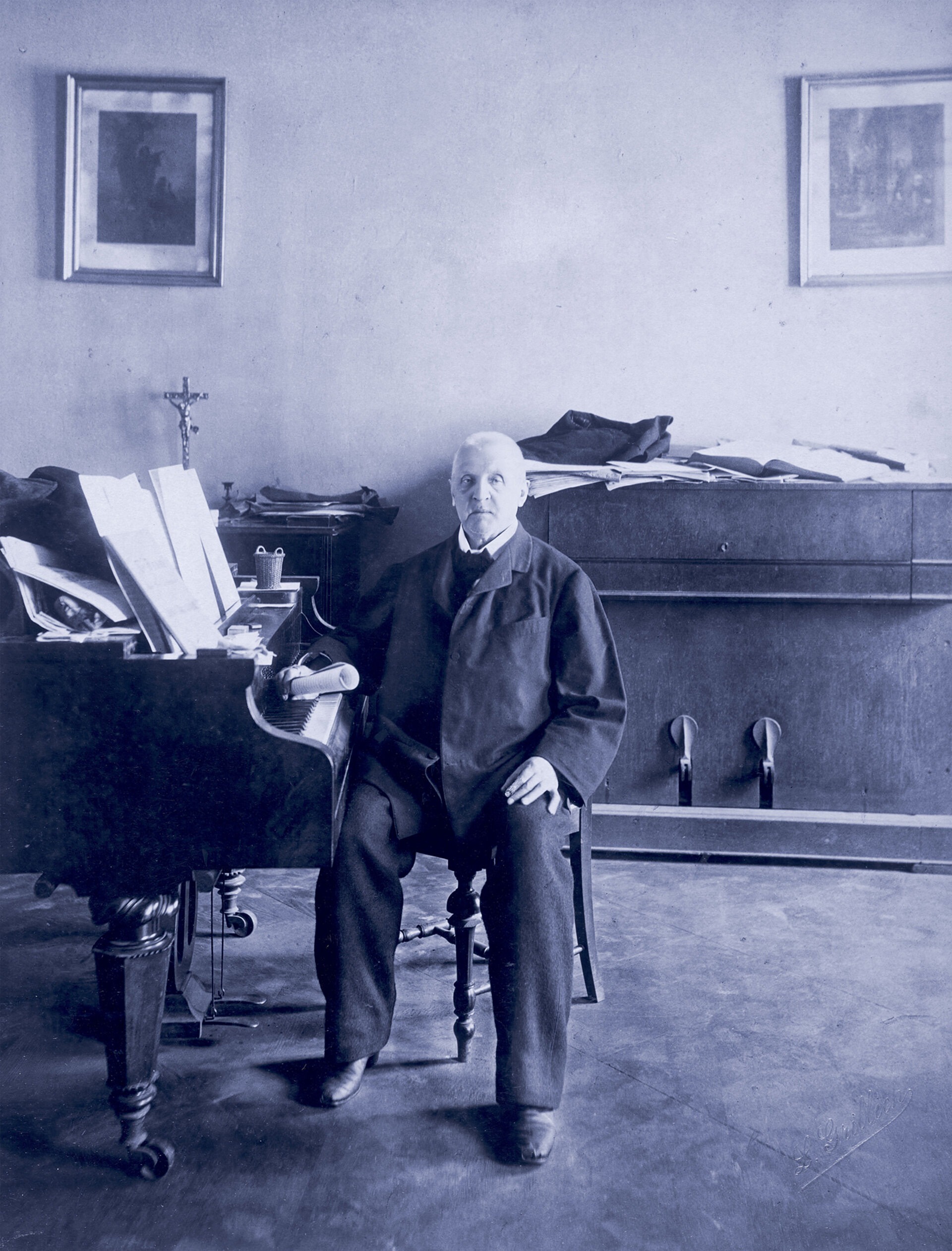
On 4th September 1824, Anton Bruckner was born intothe Grimmly named Ansfelden, Linz-Land. A variation on a fairy-tale theme, he was the eldest of 11 childrenand the son of the village schoolmaster. Though the family’s poverty rendered a solely musical career untenable, his early years ran parallel to the lines of the stave – lessons in violin and the organ from his father set the tone for the man who would come to be known for his meticulous, obsessively-calibrated scores. Prior to this symphonic success, he trained as a schoolteacher, returning from positions at Windhaag and Kronstorf to the monastery where he had once played chorister: St. Florian’s. 1855 saw him grace the organ-pipes of Linz Cathedral, before spending the best part of a decade studying under Simon Sechter and Otto Kitzler. The latter of these two pedagogues would introduce Bruckner to his most profound musical influence and champion in Richard Wagner. By 1868, Bruckner had secured the position in the Viennese Conservatory previously held by Sechter, and had become court organist for Emperor Franz Joseph I. Then, and only then, could he turn his hands to composition. 

Many biographers have gone to great lengths to demonstrate the peculiarities of this “late blooming”. Aged 38, Bruckner had already outlived Mozart and Mendelssohn’s entire careers before he put quill to stave– I daresay you can hear it. This procrastinated musical puberty meant a very choppy few years for the Austrian. His organ playing was unquestionably gifted, but his composition was the subject of frequent and vehement ridicule. Brahms would lambast his work as a toggle of‘symphonic boa-constrictors’, referring to the man himself as a drunkard and a ‘bumpkin’. Indeed, though Wagner considered him the finest symphonist since Beethoven, Bruckner’s 1877 premiere of the 3rdsymphony was such a catastrophe that most of his audience left before it had finished. As a man of perpetual low self-confidence and revision, he would go so far as to beg the emperor to prohibit the draconian critic Eduard Hanslick from writing about him. It was only twelve years before his death, upon the opening performance of his Symphony No.7 in E Major in Leipzig, that Bruckner would receive due applause for his work. The final nine years of his life would see him metronomically sway between grave illness and the attempted completion of his most grandiose aspirations yet in his Symphony No.9.

Feierlich, Misterioso. The existential sobriety of a pious man’s last musical musings is indeed enveloped in enigma. Even the famous dedication Dem Leiben Gott (To the Good Lord) is a matter of dispute, with some suggesting Bruckner’s doctor Richard Heller fabricated it. Quoted or not, it goes some way to connote the scale of this biblically infused colossus. Numerous writers (the present not exempt) have resorted to hyperbole to articulate the majestic physicality of the work. Graf would compare Bruckner to a medieval architect before a Gothic cathedral. The Glasshouse’s website calls him ‘musical marmite’, with the tagline ‘Bold. Brassy. More peaks than the highlands’. Perhaps Douglas Kennedy’s Leaving the World puts it best: ‘the search for the divine amidst the whirligig of the quotidian; the notion that there are large, ethereal forces at work in the universe’.Between belches of dissonance and swooning passages of beauty, the composer’s behemoth embraces every kaleidoscopic slide of life as the man in fever clings to the bedsheets with atavistic desperation. 

And so, it fell to the Scottish Symphony Orchestra to inflate this piece to popping point. I took my seat, awkwardly parcelled the programme below my chair, and performed the stand-up stand-down routine as last-minuters scuttled past me. Settled, the doors locked us in. The young iridule Alpesh Chauhan strutted as a gladiator to his conductor’s perch. Thus, the ring completes. I have gone to some lengths to describe the scintillating opening of the first movement, triumphant and commanding with phrases of delicacy. In many ways, this is a fitting synecdoche for the whole chapter. There are groans of elephantine proportion, and cadences like the exhalation of a dandelion on a clement gust. Rapid, tumbling passages expel us from paradise, before peacefully curious, dainty perambulations hold our hands with glee. The movement finishes as it started, as a towering pillar that confronts even the casual listener: the aggressive finger of accusation to the heavens seen in a high church spire. The Scherzo of the second movement is crashing and dynamic, tying us to the back of a chariot that drags us through wastelands by night, by way of Bruckner’s own katabasis. Bewegt, Lebhaft. Emotional and lively, it attacks the ear with vermiculite aggression, and wouldn’t be out of place replacing Williams’ famous Imperial March. Finally, the Adagio is Bruckner’s ‘farewell to life’. If the battle has been lost and won, the bittersweet third movement is reflective and elegiac, at once a lament and a celebration of achievement and decay. Langsam, Feierlich. We start as we begin, but emerge changed utterly: solemnly, but slowly. Mystery gives way to clarity and consideration, but the conclusions are of magnificent scale and effect. Unsurprisingly, there is Wagnerian climax in the spine-tingling ‘cathedral of sound’, and we are left in the cosy fallout of a truly nuclear finale. If this sounds excessive, it is. The SSO were sublime, and Flora Willson’s review was absolutely right to praise Chauhan as a charismatic and balletic conductor, at once channeling the energy of this almighty work and bridling the tension necessary to execute it. I think I heard more than one exasperated “blimey” as I walked out, bereft. 

Given this sense of closure, it is perhaps even more bizarre to consider that this was not the intended ending. As Bruckner passed on to meet his maker, the fourth movement remained unfinished. His doctor Heller claimed that ‘he had drawn up a contract with his ‘dear Lord’’ – I wonder if it was fulfilled thus. Many have edited, revised, and ornamented the final movement in vain attempts to give the piece its full glory. But to my mind, performing it as is feels overwhelming enough, only just balanced. For all his division and derision, a word that doesn’t come up enough when discussing Bruckner is poise. Whether he pushes or pulls us, toys with our expectations or fulfils them, there is an innate sense of pacing that maturely pulses throughout – a sign of his age, possibly.

Bruckner’s reception through the years has been unorthodox to say the least. His influence is hard to express, but tangible. Occupying a liminal space between Wagner and Mahler, it is unsurprising that cinematic parallels are often drawn in the epic scale of his symphonies. This occurs in translation and paraphrase: as Bergman adopted the Scherzo of Symphony No.9 in Saraband, there is certainly more than a smattering of the Jaws bass in the opening minutes of the Adagio. Some have even suggested an impression on contemporary music: take to minute 3.05 of the 2005 Munchner Philharmoniker/Christian ThielemannSymphony No.5 in B flat Major, and try not to detect The White Stripes’ painfully omnipresent Seven Nation Army riff. 

Influence aside, Bruckner has been the victim of more than one biographical embellishment or rumour through the years. We have already seen the potential tampering of his doctor, Richard Heller, in the alterations to his final work. Morbid oddities are a weed-like motif throughout his other biographies. The mammoth ninevolume work of Auer and Göllerich (1922-37) mentions a compulsion to count, claiming Bruckner was addicted to numbering everything from windows, to steps, to the bars of his scores. We are also told of nine documented proposals to women much younger than him (all rejected), and a page in his notebook reserved for those whom he had taken a fancy to. He allegedly planned his funeral with fastidious acumen, and cherished a picture of his mother on her death bed. Once more, Butt names testimonies that Bruckner had ‘fingered and kissed the skulls of Beethoven and Schubert’. There is no denying that Bruckner was a most peculiar man. 

And yet, as with all lives of the artists, we must be on our guard to writers’ attempts to make the private moments of great creators and pioneers live up to the scale of their outward inventiveness. In many ways, we probably ought to be thankful for these attention stunts: in the 1927 printing of Grove’s Dictionary of Music and Musicians, Anton Bruckner receives no more than a singular paragraph, deemed too redolent of Wagner for due time and effort. We are on the correct trajectory to rectify this misdemeanour. Although we may never know the man, the panegyrics of our eyes will always harmonise with his work. The Glasshouse’s Big Bruckner Weekend did a stupendous job of facilitating that. The exhibition Bruckner, the Pious Revolutionary at the Austrian National Library’s State Hall will hopefully amplify awareness further. Only time will tell whether we are capable of more perseverant praise than sitting up and listening at a landmark like his 200thbirthday. To plagiarise a toast, perhaps Ludwig Speidel put it best: ‘it is no common mortal who speaks to us in this music’. For all his solemnity and mystery, let us tip our hats Bruckner’s way.

Categories
Culture

I’ll Be Your Mirror, I’ll Be Your P.A.I.N. Nan Goldin and the Responsibility of Exposure

By Harry Laventure

The Photograph: 695 x 1005mm, 1984. 

More precisely, one month after being battered. The eyes neither project nor accuse, but retain a grandiosity in the look of two distinct acts. White as marble, crimson as blood, her twin axes speak in the binary colour-coding of a pill. Bruises orbit like the curls of withered petals, autumnal, but the vulnerability here is only physical. Sparked coils, almost regal, drape over the shoulders in simple decadence, and frame the punctuation mark of the picture: the rouge glamor of lips in pout, hardened. It is in this defiant diarism that we meet Nan Goldin face to face in her early career, stoic and honest to the beatings she received to conclude the “crav[ing], dependency, the adoration, the satisfaction, the security” of her relationship with an older man. Follow through to 1st July 2019, and we are electrified by the same spirit as she lies Louvre-side, still as a corpse, below a rippled slab of vermillion accusation: “SHAME ON SACKLER”.

It is in admiration of this vital force that ArtReview have recently awarded Goldin the top spot on their Power 100 list for artists of the highest influence. Such recognition titillates even the casual observer as to the merit upon which it is rewarded, and it is under the admission of such scepticism – I blame the Englishness – that I found myself investigating the life and work of Nan Goldin. What a mockery would come of my brambles. 

On 12th September 1953, Nancy ‘Nan’ Goldin was born to middle-class Jewish parents in Washinton D.C., before growing up in the deliciously named Swampscott, Massachusetts. Her early years were bedfellows to numerous tensions and tragedies, and by the age of eleven both the claustrophobia of her parents’ expectations and the suicide of her elder sister Barbara had amputated Goldin from any sense of domestic comfort. At the mercy of a carousel of foster homes, she would next find permanence in her enrolment at Satya Community School in Lincoln, aged 16. Perhaps as well timed as it was ostensibly trivial, a Polaroid camera found its way into Goldin’s possession here on the back of a grant. This has since been autobiographically retrojected as the artist’s first finding of her “voice”. 

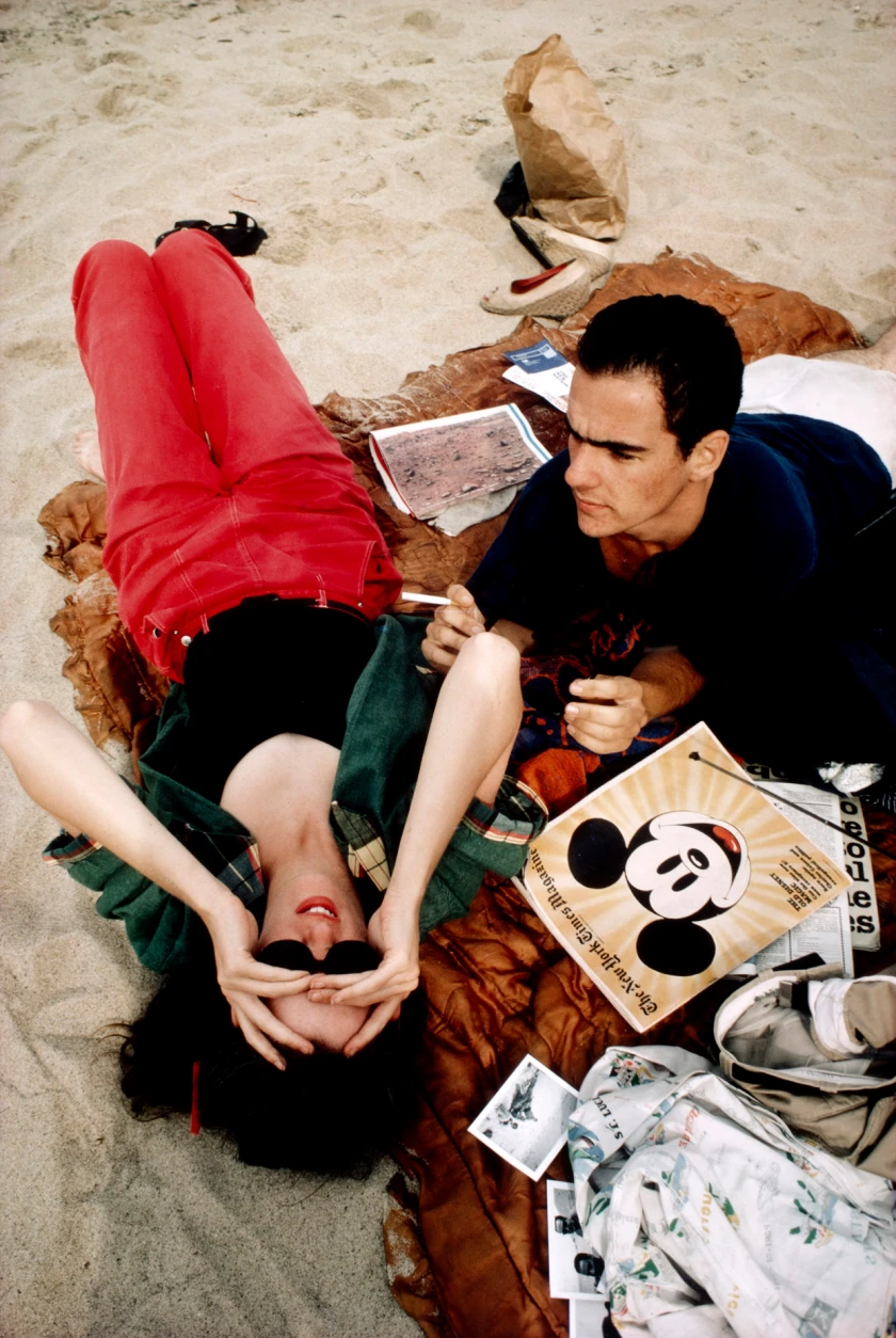
Within two years, Goldin had “[fallen] in with the drag queens” of downtown Boston. These would become her subjects, her muses, but most importantly her family. Indeed, the raw tenderness of Goldin’s first major publication The Ballad of Sexual Dependency resonates to this day, and gently showcases the intimate haze of neon Lepidoptera that defined the queer scene of the time. The style and content of The Ballad cannot be over pronounced in their influence. Her ‘snapshot’ portraits of friends at their most open capture the universal humanity of that desire for connection, in whatever manifestation of sexuality it is to be realized. In her own words, the direction of The Ballad was “to kind of glorify them” in admiration for those “who can recreate themselves and manifest their fantasies publicly”. 

Perhaps there is no more lucid an expression of this than Trixie on the Cot, New York City, 1979. Between the carelessly sensual debris of magazines, empty bottles, and cans of beer, the eponymous Trixie luxuriates like a psychedelic take on Boucher’s Madame de Pompadour. Draped in an anthology of ivories and rubies, cigarette perched between fingers and lips, she casually cradles her battered high heels. A camera lies to her left, its back ironically turned to the scene, and deaf to the bohemian elegance beyond. Quite a wily if unintentional symbol, one could wager. Further still, the magnetism of Rise and Monty Kissing, New York City, 1980 bottles the salacious lightning that pulsates through Goldin’s early work. The pair are unapologetic, absorbed, and as ignorant of as ignoring the observer in the orbit of their desire. Here, as in so much of The Ballad, Goldin articulates a truth that does not have to be staged for it to be demonstrated. 

The diaristic, deliberately unchoreographed style of these works has contributed to their endurance and continued resonance as much as the content. The hagiographists among us enjoy the idea that Goldin precipitated the social-media-style of photography that is so omnipresent in contemporary content. While I may not share such retrospective elasticity of optimism in the aesthetic components of this argument, what sings to me is the spirit behind her work. The courage to capture so much of one’s life and lives is a factor that has become all too familiar to us. And yet, Goldin’s insistence on elevating it to the boldest walls of galleries (and consequently below the loftiest noses of criticism) was unquestionably radical and revolutionary. 

As such, it was not without consequence. Freely exposing so much of oneself to the caprice of review is a posture for the confident or unwitting. In this period, Goldin has freely admitted to wanting to be a “junkie”, the “slum goddess” of whom bands like The Velvet Underground and Television wrote. The honest portrayal thereof, in all its excess and masochism, has been criticised as glamourising images in the circuit of the “heroin chic” tagline, with grave implications for those under her influence. The tortured artist trope is nearly as old as art itself, and Goldin’s intimate reflections of her own bouts of addiction personify the archetype without the usual protective distance of a name on a novel’s title page or below a painting. Perhaps there is a particularly cruel if tenuous parallel between Dostoevsky writing “The Gambler” to pay off his gambling debts, and the commercial success of Goldin’s “heroin chic” epoch funding her crippling OxyContin habit later in life. 

The nature of the criticism she received becomes more twisted still in its accusations of voyeuristic tendencies. For all the vibrant and animated beauty of her corpus, it is not without darkness. Gotscho kissing Gilles, Paris 1993 captures the ravages of the AIDS crisis in a personal, private setting. The former gently presses his lips onto the forehead of the latter, whose eyes weakly pry themselves open to burrow into the camera lens, and our sympathies behind. It is a brutally uncomfortable image. We cannot help but feel invasive, inappropriately forced into a setting of mourning usually reserved for the related. Questions of being imposters in this arena are natural, and easy to extend to the person behind the camera. The moment certainly raises disconcerting questions about the relationship of subject and object in art more generally. Does the solidification of a few images as representative of a person leave too much space for unfair projection or manipulation? Where is the border between the person behind and in front of the lens, and is it immoral to add such inflection of meaning to a scene that should or could be “objective”?

My apologies for the evasion, but this is neither the right writer nor setting to provide confident answers to these issues and their accompanying fragrances. And yet, perhaps we may poke at cadence with respect to Goldin herself. There is an obvious if implicit resolution in Goldin’s practical responses to such claims. I do wager that she is unquestionably a force for good in her exposure and humanisation of the more taboo queer subjects within her contemporary scene. The sincerity and intimacy of her works in this field are revelatory in their glorification of her family’s then-unorthodox beauty. Moreover, following her own struggles with addiction to OxyContin, Goldin has proclaimed that becoming an activist is “more important to [her] than propelling [her] art career”. Indeed, the “die-in” rallies and personal missions of Goldin’s P.A.I.N. (Prescription Addiction Intervention Now) have found such gravitas as to remove the Sackler name from gallery after gallery, even dissuading the Royal Portrait Gallery from taking a £1.5 million donation from the Purdue Pharma magnates.

With respect to the queries of voyeurism and the recklessness of her biography, I think it of the utmost importance to appreciate just how much of herself is in the work. With the camera as her “voice”, Goldin gives us a flipbook dialogue through which she negotiates her own personality through immense tragedy and hardship. Whilst I do not claim a total absence of artistic direction within her work, we must note our privilege of responding to it rather than participating in it. The characters of her corpus are not topics under examination, they are her “party”, and perhaps the family she deserved. The love affairs had their reverberations in the strands of her social spheres; the deaths and victims were sincere losses to the community that she was a member of. Placement thereof in a private, intimate setting only magnifies the impact on an observer detached from personal connection to it. Perhaps I mean to say that, to me, Goldin is not clipping the wings of butterflies to collect them, so much as she moves to accompany and admire them in flight. 

These remarks are of course my own, and my only desire in writing this is to stimulate your own interpretations of her work. The critics continue to laud: her 2022 biopic All the Beauty and the Bloodshed was peppered with awards and applause, and her placement on ArtReview’s list will only prompt more panegyrics and vitriol. Goldin’s original pledge to her friends was to “reflect to you the beauty that you are ”. In her constellations of ragged decadence, excess, intimacy, sincerity, trauma, and ultimate splendor, we must grant her that.

Brava, Nan Goldin.